We have prepared a number of changes that should make the interface 1C:Enterprise more convenient and enhance its usability. It is known that the user experience is affected not only the big, fundamental solutions, but also a significant number of “little things”, which constantly faces the user. In versions 8.3.8 and 8.3.9, we decided to collect some “inconvenient trifles”, and improve it work.
The width of the drop-down list of the input field
Implemented in version 8.3.8.1652.
Previously, the width of the drop-down list of the input field was constant and didn’t change during operation. When you know that the representation of the elements will be too long, you can set the desired width of the list using the properties DropListWidth. For example, Customers catalog or any other list with fixed description width.
But for other catalogs, where you don’t know in advance how long description will be, such approach has not worked. For example, Good catalog may have elements with both long and short description. In this case, long descriptions do not fit in width in drop-down list. You may see it completely in the tooltip, which is inconvenient with keyboard input.

But increase list width by default not good as well, because in a lot of cases, it will simply take up too much space on the screen.
To solve this problem, we have changed the behavior of drop-down list of the input field to automatically adjust its width to the width of the display elements in it.

Now, if one of the elements is wider than the minimum width of the list, drop-down list takes the widest width of the display element. But no more than the size of the container, which displays a list (in a thin client is the screen size, and the Web client is the size of the form).
The minimum width of the drop-down list, as before, is defined as the maximum value of a fixed value set by a constant in the Platform, and the property value DropListWidth.
If the drop-down list is already open, and in the process of selection is required to increase or reduce its width, the change is happening with animation.
We also changed the behavior when you press the Home and End keys. Previously, when the field is in edit mode, and it has opened dropdown list, pressing these keys moves the cursor up and down the list.
Now, in a similar situation, these keys move the cursor to the beginning or the end of the text in the input field. And in combination with the Shift key, they select text in the field. This behavior is more consistent with the expectations of users and allows to work more efficiently.
Ease of working with lists of documents
Implemented in version 8.3.8.1652.
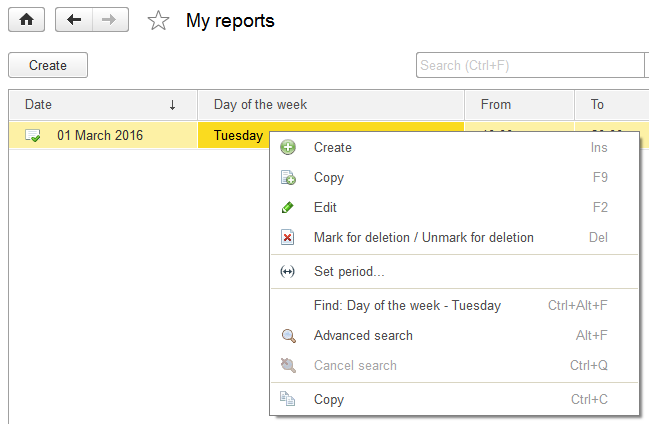
Working with lists of documents or journals document is somewhat different from working with other lists. Documents have a number of features that are used often, but access to them in the list form was not very convenient. Through the More menu, or via the command panel form.
Now we have added these commands to the context menu of the table.
8.3.7

8.3.8

Log out from client application
Implemented in version 8.3.8.1652.
Previously, users are accustomed to work with Web applications, have experienced a certain discomfort from the fact that they did not see the log off button. But in order to log off from web-based applications properly users should not just close the browser window, but to execute this command. Which as well will complete authenticated session. So the next time the application will not start silently, but will ask for the login and password.
1C:Enterprise has button Exit (if using OpenID-authentication), but it is located in the File menu, and many users do not know about it.

To make the user more familiar, we’ve added the Log out command in the application title, next to About button. It is displayed as a hyperlink with the name of the current user.

Clicking on the hyperlink opens a dialogue with the user name and Log out command.

This command, for regular authentication, completes client application. And with OpenID-authentication, it completes the user session (OpenID logout) and also terminates the application.
When publishing information database on the Web server, you can specify the URL, which will be used to redirect web-client after log out. For example, to return to the main service provider’s page, if user was working with application in SaaS model.
Scrolling in dynamic lists
Implemented in version 8.3.8.1652.
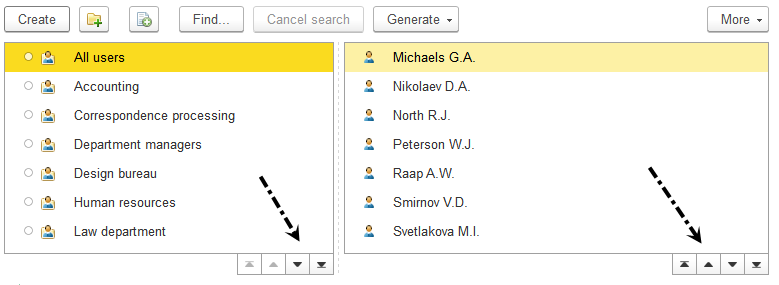
We have changed the display of a vertical scroll in the tables associated with dynamic lists. Now, under the lower-right corner of the table there are four buttons that allow you to move to the beginning, to the end of the table, as well as a page up or page down.

We think these buttons allow more convenient and easier to perform the most common actions in a large list. Previously, not all users understood how to go to the very top, the bottom of the list, or scroll through the pages. Now follow the steps will be easier. Including because the same approach (paging) is partly received in a web application to display very large lists.
A vertical bar that displays scrolling is now available. A horizontal scrolling is displayed in the same way as before, under the table, in an area not occupied by the buttons. But now it is drawn (as well as all of the scroll bar) darker color than before, so clearly visible in the form.
The vertical scroll bar we removed because its current view was misleading. Users perceived it as usual (the same as all the others), the scroll bar, and tried to move the slider. It did not give them the desired result, because dynamic list does not work this way.
The purpose of dynamic list - quickly show a small part of, perhaps, a vast array of data stored in the database. This dynamic list does not analyze all available data set. On one hand this allows to work quickly, on the other hand, for the same reason, it does not have information about which part of the data portion is displayed.
Therefore, removing the vertical scroll bar with a runner, we, in fact, have brought dynamic list behavior in accordance with its actual capabilities.
