Released in 1C:Enterprise 8.3.10
We have changed the design of the opened items panel and extend its functionality.

Now it looks neater and takes up less space. At the same time its descriptiveness is not diminished. Along with this, the panel has set of new features that should make it easier to work with a large number of open windows.
Appearance
When the panel is placed horizontally, the first thing that catches the eye is its compactness. Indeed, the text on the tabs are now always displayed in one line. A start page tab, except for the text, contains an icon.
When the width of the main window no longer enough to fully display the bookmark text, the home tab page decreases. It remains only an icon, the text disappears.

As soon as some tabs text begins to be cut on the right side panel there is a button to display a list of all windows. In this list you can see complete description for all opened windows. Active window is highlighted with a green marker.
The list of all windows elements are not in the order that they have in the panel, but in alphabetical order. It will allow you to find the window you want faster.
When the panel is open vertically, it looks different. The text in the tabs displayed without limitations on the number of rows. If the bookmarks are no longer placed in height, appears in the panel a vertical scroll bar. And scroll all bookmarks, except the home page. The home tab is always at the top of the panel.

Closing windows
As before, you can close any window by clicking the mouse on the cross on desired tab. However, we have implemented a quicker way to close a single window. Now simply press the middle mouse button on any tab and the following window will be closed.
In addition, you can now quickly close multiple windows. On the context menu, open bar, there are three new teams. It allows you to close all the windows, all windows except the one on which you clicked, or all the windows are in the right panel (below) from that tab, on which you call the menu.

When redrawing the bookmarks bar is now used animation. Only, of course, if the menu animation is not turned off in Windows settings.
The order of bookmarks
Another new feature that we have implemented, is that you can drag and drop tabs on the panel, and arrange them in the order you want.

Attaching windows
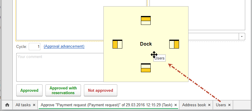
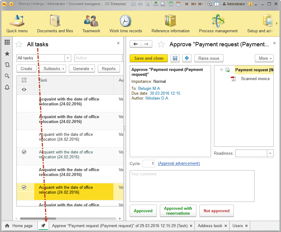
You can drag and drop tabs not only inside the panel, but in the main workspace page as well. In this case, an additional window appears on the screen, through which you can choose where to dock this tab.

Docked window appears as an icon without text. Because title of the window is always presented in the work area.

We expect that the new features for the panel will help users better navigate between opened windows.
