Lesson 4-1
User Interface Basics
We are developing a fairly simple application and didn’t even finish yet, but the interface is already a mess. This part of the main application window (called a Main Section) contains links to documents (of various types), inventory, people and companies - all mixed up (more exactly - in an alphabetical order).

From the usability point of view, this interface is far from being perfect. It’s going to take a while before a user finds the link he needs. It’s not that obvious for our relatively small app, but it can be a nightmare in a real-world system with hundreds of links.
What can we do to tidy it up? Well, a lot of things, but let’s start with basics.
Three types of user interface
The Platform’s approach to interface evolved over time according to changing user requirements and advancing experience. There are three main types of user interface available today:
- Ordinary interface - traditional old-style multi-form desktop app interface
- Managed interface, which appearance is very alike to the ordinary interface but the underlying principles (the way a developer builds the application) are quite different
- “Taxi” interface - single-form, modern-looking, WEB and mobile device-ready interface
Let’s see what do they look like and how you switch the application between them.
Please, note, that the difference between an Ordinary and Managed applications is not about the interface appearance only. Managed application builds the interface at runtime according to its dynamic description, whereas Ordinary application shows, basically, a ready-to-use picture. Therefore, with Managed application a developer has much more freedom controlling the interface elements visibility, position, appearance and so on in runtime.
One more worth mentioning difference is that ordinary interface doesn’t require a developer to specify explicitly where a form procedure or function is to run - on the client or on the server side (any code can be run anywhere, and the Platform chooses the specific side at runtime). It results in very extensive traffic between client and server only high-speed local network connection can cope with. So, when you use the Ordinary application, you need to run both client and server within the same local network. Otherwise the app’s performance can be severely compromised.
Managed application is much more careful about client-server traffic (and gives a developer an opportunity to control client-server interaction), so the client can be run everywhere and connected with 1C:Enterprise server through any network including slow ones (like GPRS).
Here is a table summing up the information on these three application interface types.
| Feature | Ordinary application | Managed application | |
| 8.2 | Taxi | ||
| Appearance | Old-style multi-form desktop app | Modern-looking single-form universal app | |
| User skills | More complex. May require users training | Simpler (WEB page-looking app, straightforward) | |
| Developer skills | Simpler (no client-server interaction code needed) | More complex (explicit coding of client-server interaction) | |
| Client types | The thick client only | Thick client, thin client, WEB client, mobile client | |
| Interface elements runtime controllability | Very limited | Almost limitless | |
| Client-server connection requirements | Client and server have to be within the same local network | Client and server can be connected with a network of any capacity (including GPRS). |
We consider an Ordinary and 8.2-compatible applications to be obsolete and do not recommend you using them developing your apps. These modes are kept in the Platform for backward compatibility with apps developed for previous versions.
In this course, we are considering only the Managed Application with Taxi interface.
Commands
1C:Enterprise client’s interface official name is the Command Interface and any user interaction with the interface results in the running of a specific command. You can think of a command as an interactive visual element (link, button, icon, tab and so on) that can be clicked by a user, plus some specific action associated with it.
Here are some examples of commands:

Some commands (called System Commands) are predefined by the Platform and cannot be changed by the developer in any way. But a developer (and a user - to some extent) can choose if they want the commands to be shown and (sometimes) where they want them to be shown. These commands are created by the Platform in association with a specific metadata object. For example, every time you create a new Catalog, the Platform adds to a Command Interface the following commands:
- Open the list form;
- Open the item form to create a new item;
- Open a group form to create new group;
- …
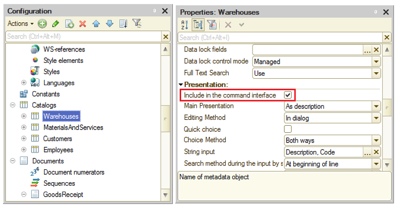
A developer controls the availability of these commands in the interface by selecting/deselecting of this checkbox:

If the metadata object has this option off, its commands won’t be visible anywhere in the command interface. You might want to deselect this checkbox for metadata objects you created for internal use. For instance, you are developing a mail client functionality and want to remember last five email addresses a user sent emails to. The metadata object you store this data in (it should be an Information register we will discuss later) doesn’t really needs to be shown in the interface for direct user editing (your 1C code will add and delete all data automatically). In order to hide this object-related commands from the interface, you need to deselect this checkbox.
Note, that the deselecting of this checkbox doesn’t make the object data inaccessible. Users still can execute a code accessing the object’s data and changing it. Users also can get the objects’ list opened using All functions command in the main menu (if their role allows it).
Aside from the system commands, a developer can explicitly define any commands he needs in the Designer mode and add them into the Command interface. In this case, the developer specifies the source code that is to be executed when a user runs the command.
So there is a bunch of System Commands created by the Platform (according to the Metadata structure a developer created) plus explicit commands implemented by a developer. How do we place them in the interface?
Main section command interface
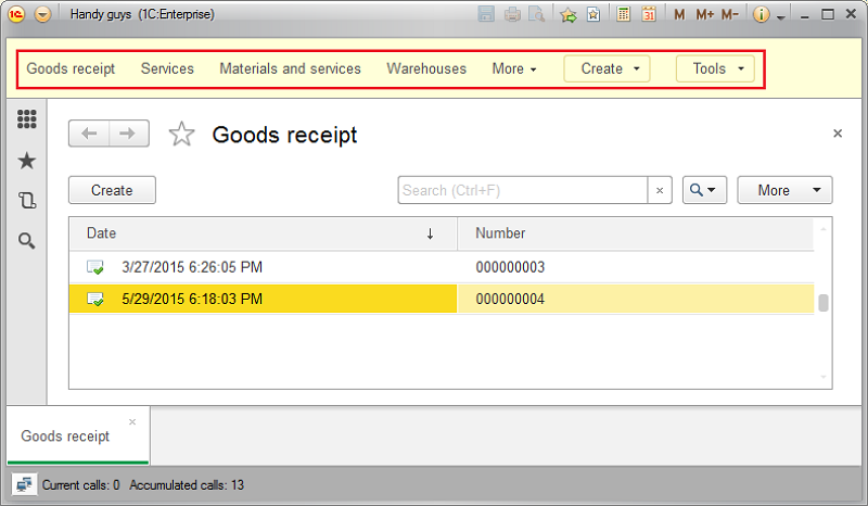
The area called a Main Section is, basically, the main window of an application. Its command interface serves as the main navigation tool - users see it in front of them all the time and use it to switch between different tasks. For example, a user can click the Goods Receipt link and the list of GoodsReceipt documents will be open within the main window, leaving all Main Section commands visible.
Here is the Main Section command interface:

What is shown here and how a developer can control it?
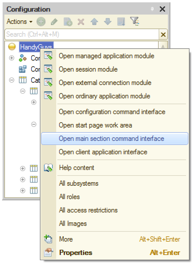
To answer this you need to select the Open main section command interface context menu item on the top of the configuration tree:

The windows being opened is called a Main Section Command Interface editor and here is how it works:
So, summing up all of the above:
- Adding a new metadata object, a developer defines if the object to be accessible from the interface by selecting/deselecting the Include in the command interface checkbox.
- A developer defines the default command interface, placing the commands in the Main section.
- A user can change it in any way, including showing or hiding elements, moving them into different sections and so on.
Desktop
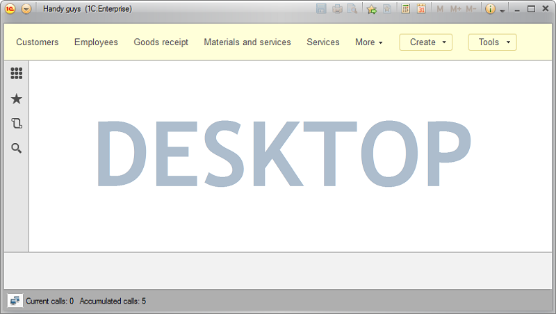
Some forms are used more frequently than other. One or two of them are usually so popular that you might want them to be automatically opened at the start of the system. These forms will be shown in the area called a Starting Page Working Area (or the Desktop).

Here is how it works.
Lesson 3-5 | Course description | Lesson 4-2
