
1C:Enterprise 8.3. Developer Guide. Contents
DEVELOPMENT TOOLS
26.1. FORM EDITOR
26.1.1. Background Information
Form editor can be used to perform all actions related to form creation and modification. It is a group of several interrelated editors:
attribute editor – Attributes tab
command editor – Commands tab
item editor – Elements tab
parameter editor – Parameters tab
module editor – Module tab
command interface editor – Command interface tab The bottom part of the window contains the form preview.
Editors support multiple selection. In this case the properties palette displays properties common to all the selected objects. Changes made in the properties palette are applied to all the selected objects (see fig. 330).
Form elements are usually added by dragging form attributes to the item panel. Form element is assigned attribute name as its name and attribute path as its data. The system automatically defines both the form element to display the attribute and the item type (if possible). Form element name is automatically set equal to the attribute name; however, it is done for developer convenience only.
Similarly, commands (both form commands and global commands) are added to forms. If form attribute or command has been placed in a form, a special grey marker is displayed to the right of its name.
When a form element is selected in the Elements tab, it is automatically positioned in the preview window. If an element is selected in the preview window, it is automatically positioned in the element tree in the Elements tab (see fig. 331).
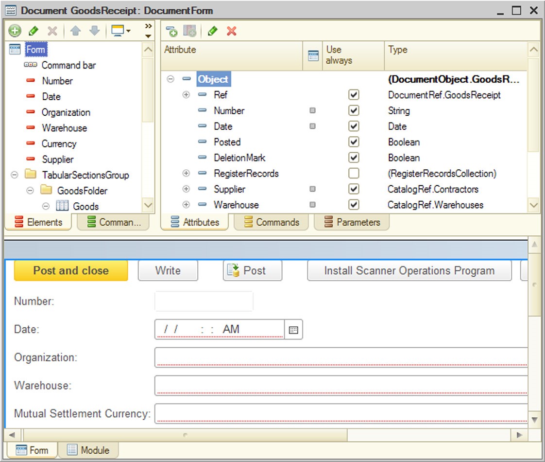
Fig. 330. Form Editor
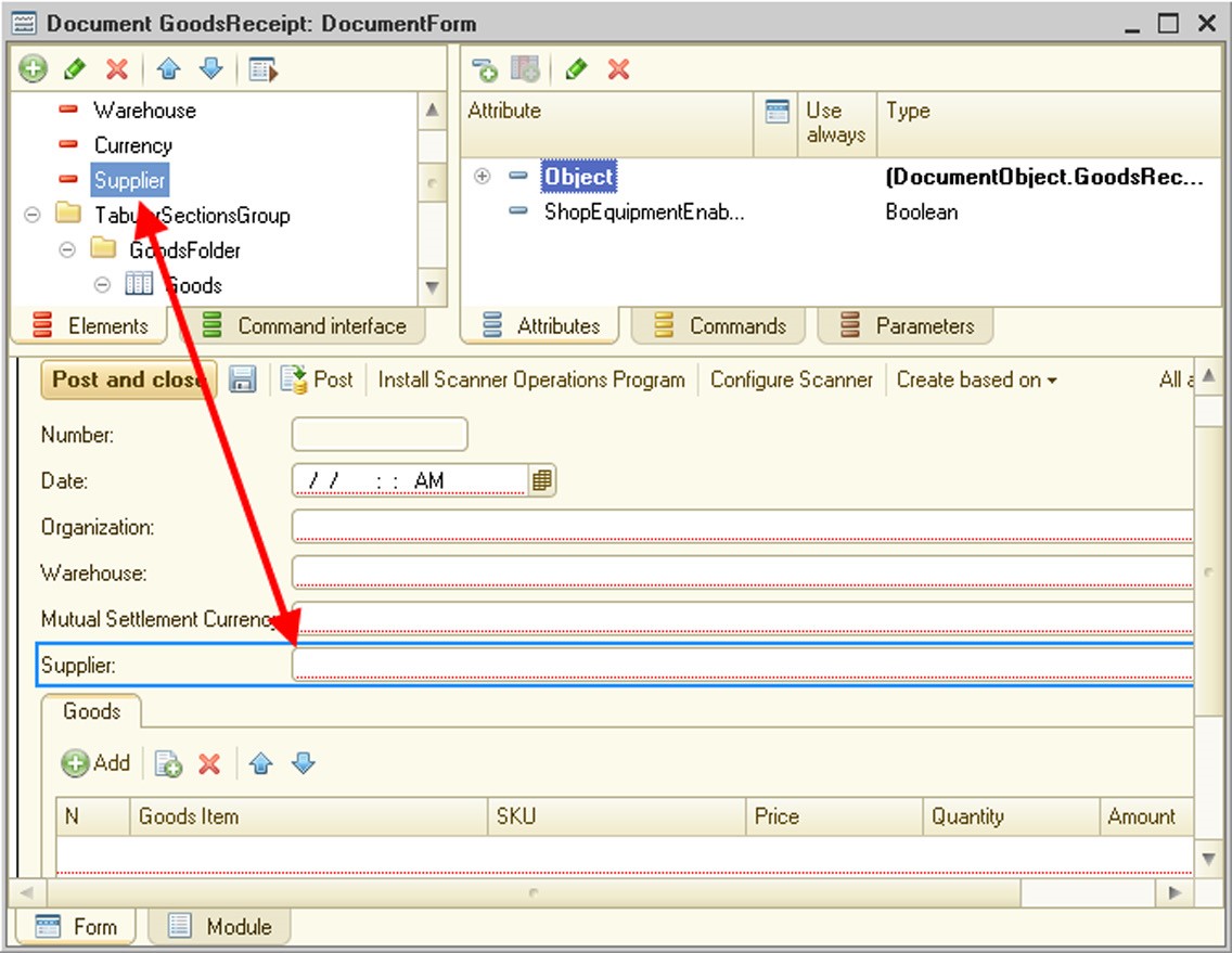
Fig. 331. Editors relation
Thus, you can select form elements in the element editor and in the preview window. Functionality in the preview window is nearly similar to the functionality in the element list. In particular, element context menus, the properties window, element dragging, etc. are available. When an element is selected in the preview window, a frame is shown around the element that can have different colors based on the element:
|
Frame color |
Description |
|
Blue |
Selection of a normal element. |
|
Orange |
Selection of automatically created buttons and command bar submenus. It is used to indicate that the configuration (properties, position) is not available for this element. |
|
Grey |
Selection of a parent element if the selected element can't be selected in the preview window. For example, if you select the text box context menu in the element list, the text box will be highlighted in grey in the preview window. |
|
Green |
Used when elements are dragged, the control to which the selected element is dragged (e.g., a table or a form group) and the indicator of the position where the dragged element will be placed are shown. |
If you need to select a parent element (e.g., a group containing a field) for any other element, you can left-click the subordinate element twice sequentially. This selection is possible if the interval between the two clicks is 1 to 2 seconds. If the interval is less than 1 to 2 seconds, the system can interpret it as a double click; if the interval is greater than 1 to 2 seconds, the system can interpret it as separate actions. If on the first click several elements are selected, the parent element will not be selected.
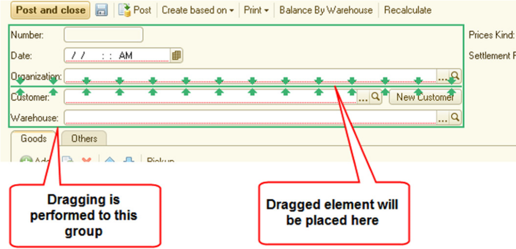
Fig. 332. Drag-and-drop indication
The Go To command is used to quickly move to linked objects. This command is located in the object context menu in element editors, command interface fragments, attributes, commands and the preview window. This command can be used, for example, to quickly move from a form element (selected in the element list or preview window) to a form attribute displayed by this element. If you can go to several elements, a window with a prompt to select the object you need will be opened.
Also, in the form editor, you can quickly create (or go to) event handlers of certain form elements using the Events submenu of the element context menu.
This menu includes all events available for this form element in the properties window of this element. If an event name is specified in angle brackets in the menu, the event handler can't be determined (for example, for the Clearing event of the Organization element in the fig. 333. You should select the event you need to create the handler – the form module editor will be opened and the handler will be created.
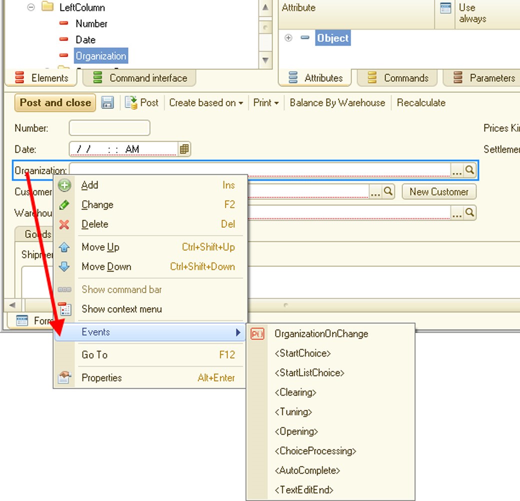
Fig. 333. Events menu
If the event handler has already been created and you click the corresponding command in the Events submenu, you will be moved to the existing handler in the form editor (for example, OrganizationOnChange() handler in the fig. 333.
The Events submenu is not generated for a button, and the GoTo command for a corresponding command handler is located directly in the element context menu.
If you create a client handler, the system has multiple creation options available:

Fig. 334. Creation of client handler
If you select the first option (Create on client), a client event handler only is created. In the Create on client and a procedure on server (no context) option, a client event handler is created along with a server-side procedure with no context, and the procedure is called from the client handler. In the last option a server-side context procedure is created. If context server calls are not recommended for a certain client event handler (you can find this information in the Syntax Assistant), the last option (with the server-side context procedure) is unavailable. Deleting an event handler does not remove the server procedure (if the latter is created during event handler creation).
When an attribute is deleted (from a form attribute list), the Do you want to delete the related items? message is displayed. If the answer is negative, the Data property is cleared for linked form elements. If the answer is positive, form elements linked to the deleted attribute are deleted. If the link with this attribute is not the main link for the element (footer data, data displayed in the group title, etc.), this element is not deleted, but the link with the deleted attribute is cleared. Regardless of the answer for the deletion prompt, form command interface commands linked to the deleted attribute will be deleted.
When a form command is deleted, the user is prompted to delete all linked elements. If the answer is negative, form elements are not deleted, but the Command element property is cleared. If the answer is positive, buttons linked to the deleted command are deleted.
When you develop a form that you wish to display in both the Taxi and Version 8.2 interfaces, you need to see how the form is displayed in both interface modes. You can do this in the form editor.
See fig. 335 for an example of how the display changes when you switch from the Taxi interface (upper left-hand view) to the Version 8.2 interface (lower right-hand view). Please remember that some items are displayed in the Version 8.2 interface when you test the form in the Taxi interface.
The Interface mode button is only available if the Interface compatibility mode property is set to Taxi. Version 8.2 allowed or Version 8.2. Taxi allowed. Otherwise, this button is not displayed in the form editor.
To open and check a form, press Ctrl + R. The form opens in a new window.
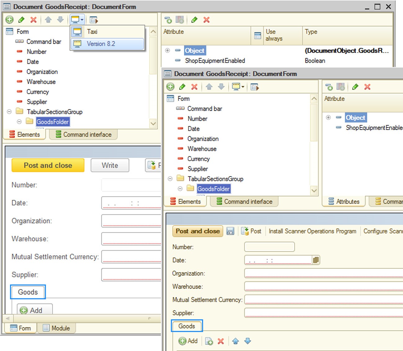
Fig. 335. Switching interface mode
26.1.2. Role-Based Form Setup
Form editor supports role-based form behavior setup.
This feature is available for the following properties:
View – form attribute property. If an attribute cannot be viewed, it is not included in form data (it is not transferred from the server). The user cannot modify this setting.
Edit – form attribute property. If an attribute cannot be edited, its associated form element is read-only. Regardless of how this property is set, the attribute cannot be edited if it cannot be viewed. The user cannot modify this setting.
User visibility – form element property. It defines default visibility of a form element. The user can modify this property in the form settings editor.
Use – form command property. If the Use property is disabled for a command, all of its associated buttons are not included in the command interface.
The user cannot modify this setting.
Editors for all the above properties are identical both in appearance and in operation. Review how editors work using the View property as an example.

Fig. 336. Editing Form Attribute "View" Property
The View property (in the upper part of the editor window) defines visibility for each role with the check box in the third position (shaded check box). Then visibility status for all the available roles are added up using the OR concatenation and the result determines the final View property value for the edited object.
26.2. TEXT EDITOR
1C:Enterprise text editor gives users all basic functions needed to edit texts. Operations with text blocks, search and replacement functions and color syntax highlighting are standard features of the text editor.
The text editor in the 1C:Enterprise system uses two modes: editing text documents and editing modules (part of the form editor).
This chapter describes the text editor features used while editing modules.
Since all text editor interfaces in Microsoft Windows are similar, in this chapter we describe only those features of the text editor that are specific to the 1C:Enterprise platform.
NOTE
Characters that are incompatible with XML specification version 1.0 are not allowed in the text editor. If the user attempts to enter such a character, it is ignored; if pasting from clipboard is used, invalid characters are skipped and are not inserted in the pasted text.
For help with text editor hot key combinations use the Help menu.
26.2.1. Editing Modules
Modules are edited when a configuration object form is created or modules are developed (application module, external connection module, general modules or application object modules).
When a form is created, the text editor appears as part of the form editor. To open it, click on the Module tab in the form editor window. In all the other cases the text editor opens in a new window. If you need to open a managed application module, external connection module, session module or ordinary application module, rightclick the configuration name (uppermost configuration tree branch) and select the appropriate item in the context menu.
To edit object module select the object and choose Open Object Module in the context menu.
To edit manager module (if available for an object) select the object and choose Open manager module in the context menu.
To edit a command module double-click the command or select Open command module in the command context menu.
To edit common module in the Configuration window on the Common – Common modules branch select the required module and choose Open Module in the context menu.
Program module text editing process is similar to the text document editing process. You can use all text editor features.
This section contains the description of all specific text editor features that are available for module editing.
26.2.1.1. Color Syntax Highlighting
To make module editing more convenient 1C:Enterprise text editor can highlight the 1C:Enterprise script items with different colors (keywords, constants (other than configuration objects), different types, operators, remarks, etc.). You can set the colors for different syntactic constructs in the Options window by going to Tools – Options (for information about setting up text editor parameters see page 2-1150).
Built-in function names are not highlighted (the color is the same as for IDs).
In general this feature is activated automatically any time you launch text editor to edit module text. But sometimes module text is located in external text file. When opening this kind of file, the Designer does not recognize the module and treats it as an ordinary text document. In this case syntax highlighting and automatic module text formatting is not available while editing the text. The Text –Script menu item which functions as a toggle shows the Designer that a module is being edited rather than a text document.
When this menu item is turned on (a checkmark appears to the left of the Script menu item), the text editor treats the loaded text as module text and highlights syntax in color.
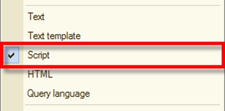
Fig. 337. Syntax Highlighting On
When this mode is on, a regular text document is displayed with the font set as default for module text in the Designer parameter settings (Tools – Options menu item, Texts tab, Font attribute).
The parameter settings in the 1C:Enterprise system allow the syntax color highlighting to be turned off; in this case selecting the Script item does not enable the color highlighting for module syntactic constructs, but uses the module print and tab spacing settings only.
If the syntax color highlighting mode is switched off, operating system colors are used for typing out the text.
26.2.1.2. Group
In modules or text documents viewed in the Script mode some syntactic constructs are automatically grouped. These include If … Then … EndIf, While … Do … EndDo, Procedure … EndProcedure and others.
Text groups improve readability of different text parts and support move and copy functions for entire groups. See fig. 338 to understand how groups are displayed.
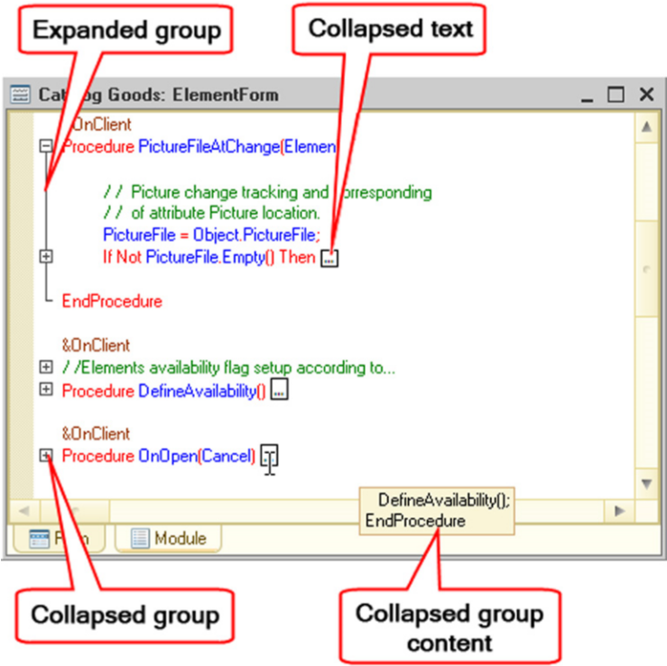
Fig. 338. Groups in Text Editor
You can expand or collapse a group with the mouse. To do this, simply left- click on the group marker.
If you hold down the Ctrl key while clicking all nested groups (conditions, cycles, etc.), they also collapse or expand.
To display collapsed text move the cursor over the marker, as shown on fig. 338.
If the text is too large, only its initial part appears.
You might need to group module fragments in the development process. For example, if you need to select logically connected procedures or functions or to select algorithm fragments within a single procedure or function, you can use preprocessor directives #Region … #EndRegion.

Fig. 339. Grouping rows
All rows within a region that is limited by the preprocessor directives can be collapsed in the module editor (just like other 1C:Enterprise script syntactic constructions). Each region must have a name based on the 1C:Enterprise script rules. In the example shown on fig. 340, the region is named PictureFile. Regions can be nested, but they cannot overlap with other syntactic constructions of the 1C:Enterprise script. A number of examples, both correct and incorrect, for using regions can be found below:
//  Correct example of using a region
#Region  Correct
…
#If  Client Then
…
#EndIf
…
#EndRegion

//  Nested regions
#Region  CalculationAlgorithm
…
#Region  Stage1
…
#EndRegion
…
#Region  Stage2
…
#EndRegion
…
#EndRegion

//  Incorrect example of using a region
#Region  Incorrect
…
#If  Client Then
…
#EndRegion
…
#EndIf

//  Incorrect example of using a region
#Region  Incorrect
Procedure  GetData()
…
#EndRegion
…
EndProcedure
A region can be described using a comment inserted before the region (#Region). The comment can also be grouped.
Groups can be easily manipulated using keyboard shortcuts.
|
Keyboard shortcut |
Actions |
|
Ctrl + Num - |
Collapses the group (cursor can be anywhere in the group) |
|
Ctrl + Num + |
Expands the group (cursor has to be over the first line of the group) |
|
Ctrl + Shift + Num - |
Collapses all the groups |
|
Ctrl + Shift + Num + |
Expands all the groups |
|
Ctrl + Shift + R |
Refreshes the groups |
During write operations groups are automatically created for all syntactic constructs of any nesting level by completing the writing of the syntax statement. Groups can be updated using the Text – Groupings – Refresh Groups item or automatically when saving text according to the group display settings.
Description of procedures, functions, and regions is considered the first level and the second level is syntactic constructs that are nested in procedure or function body, but not in the body of other syntax statements. Group display mode can be set up. For information about mode setup see page 2-1153.
26.2.1.3. Module Formatting
1C:Enterprise text editor includes a number of modes making module development easier.
Syntax Formatting
Using syntax indention – marking the 1C:Enterprise script control directives with leading spaces (tabulations), as shown below in a module fragment, is considered good practice for code writing.
Procedure  NextItem(Catalog, Selection)

While True Do

If Selection.Next() = False Then

Selection = Catalog.Select();
Continue;
Else

Abort;
EndIf;

If Selection.IsFolder Then

Continue;
EndIf;
Return;
EndDo;
EndProcedure
In this fragment module strings placed inside structure operators If … Then … EndIf and While … Do … EndDo are shifted to the right in order to accentuate their nesting. Module text formatted using syntax indention is easier to read and debug.
1C:Enterprise text editor provides automatic formatting functions for 1C:Enterprise script control directives. For setting up automatic formatting in the system settings mode (in Designer, Tools menu, Options section, Modules tab), one of two indention options can be chosen.
Syntax indent makes module text formatting automatic, shifting the text located inside control directives If … Then … EndIf and While … Do … EndDo (and the like) to the right. Shifting is performed by adding the necessary number of tab symbols at the beginning of lines.
The standard indent automatically aligns the line text to the left of the previous line.
If automatic indent is disabled, no other extra characters are added to the text.
Besides automatic formatting of module text during entry process, text that has already been entered can also be formatted. To do this, select a text block to be formatted and choose the Text – Block – Format menu item. The text editor analyzes the module text and formats it so that each syntactic construct is shifted to the right based on the tab size regardless of the original line placement (leading spaces). The empty lines are filled with tab symbols in accordance with the syntactic construct.
It is possible to move text blocks using left or right tabbing. To do this, highlight a text block and choose the Text – Block – Increase Indent (Text – Block – Decrease Indent) command.
1C:Enterprise text editor automatically deletes spaces at the ends of the lines. This is performed while recording a module.
Insertion/Deletion of Comment Marker
When debugging modules it is often required to temporarily "switch off" some module lines to prevent them from executing during a system run. This is usually done by changing these lines into comments – by inserting the // comment marker before them. To later "switch on" the lines converted into comments, delete the comment marker.
For switching large module fragments off (and on), it is convenient to use the Auto add comment markers mode for all selected block lines or for the current line (selecting the line is not necessary).
In this case a block of text needs to be selected or the pointer needs to be placed over the desired line and the Text – Block – Add Comment (Text – Block – Delete Comment) item chosen.
When more than one comment marker is placed before the line, only one is deleted when deleting the comment.
Insertion/Deletion of Line Wrapping
When writing string constants, the | symbol is used to wrap the line.
You can easily add or delete this symbol to/from highlighted lines using the text editor.
To insert/delete the line wrap symbol in all lines within the selected block or in the current line (no need to select a single line), specify the area and select the
Text – Block – Insert Line Break (to insert the symbol) or Text – Block – Delete Line Break (to delete it).
The line wrap symbol is inserted in the left most important position (other than space or tab character) of each line.
26.2.1.4. Navigation of Module Procedures and Functions
With a large number of procedure and function descriptions contained in the module, it is convenient to use the procedure search mode supplied by the 1C:Enterprise text editor.
Text – Procedures and Functions command displays a window with a list of all procedures and functions in the module being edited (see fig. 340).
Procedure and function names are displayed on the list in the order of their placement in the module. If the Sort option is on, the list is sorted alphabetically.
Procedure and function names already placed in the form have an icon to their left.
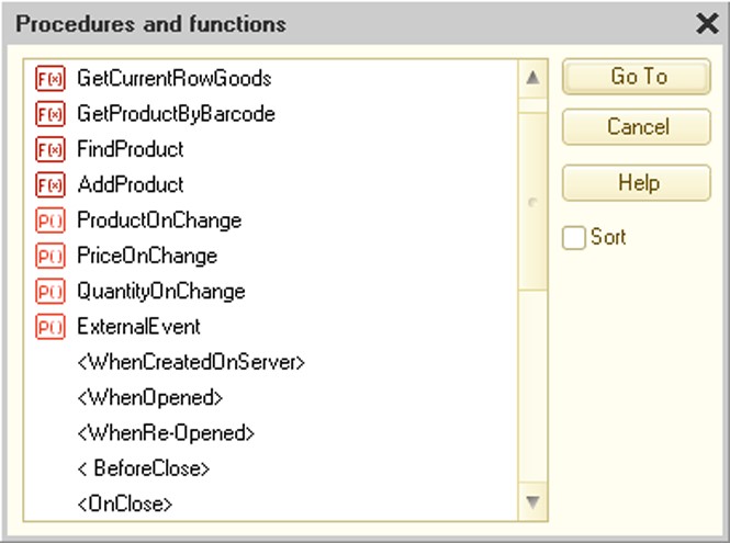
Fig. 340. List of Procedures and Functions
To navigate to a needed procedure or function, select its name on the list and press the Go To button.
Names of events with no handler procedures are shown in angle brackets in the procedures and functions list. Created procedures and functions are marked with P() and F(õ), respectively, displayed in front of their names. Events that can be handled are defined by the object and form type as well as the controls located in the form. When this kind of line is selected, predefined procedure text is added to the module and a reference to the procedure is added to the appropriate event in the Events category.
IMPORTANT!
Event handler procedures (defined by the system for a module) should be created within the form properties palette, the Events category, by using either the Procedures and functions window or the Procedures and functions list box. If you simply try to copy the event handler procedures from different modules, the event handlers from other modules will not be initiated in the form and the copied procedures will not be called up to process the events.
When moving the cursor to the module line, the name of the current procedure or function is shown in the procedure selection field of the Module toolbar (Procedures and functions command). Using this list, you can switch to the needed procedure or function.
To navigate to a procedure, function or variable, click the appropriate name with the mouse and press F12. Switching is possible only for procedures, functions and variables placed in this module or procedures to be exported, functions and variables of application module, common modules and object modules. To return to the initial point of navigation press Ctrl + - (next to the = key).
If the recorded expression consists of parts defined in different configuration locations, prior to switching the list of similar objects appears on the screen in order to choose the switch. You can navigate to a variable definition, metadata object definition with the object type equal to the current expression or procedure or function definition used in the expression (for example, in a module of the object with the type matching that of the expression).
For example, if F12 is pressed for the Cat.FindByCode() expression where Cat is defined as Currencies catalog, it displays a list of navigation to the Cat variable definition and the Catalogs – Currencies metadata object definition in the configuration object tree.
26.2.1.5. Context Tips During Module Text Entry
The 1C:Enterprise system text editor allows contextual entering of expressions using system objects, their properties, methods, procedures and functions, object description defined in the configuration as well as variables, procedures and functions defined in common modules, application object modules and form modules. Predefined items of catalogs, charts of accounts, charts of characteristic types and charts of calculation types are included in the list.
Text templates and keywords can also be included in the context tip list.
NOTE
Context text tips are not supported by the system for text documents with the Script property enabled.
Text is entered from the list displayed as a context menu at the current cursor position (relative to the screen edges).
The list is called by pressing Ctrl + Spacebar at any stage of expression entry or automatically upon entering the . character after an expression that represents an object with properties or/and methods (if the contextual help is enabled, see page 2-1154).
The contents of the list depend on the program module execution context (see section "1C:Enterprise Script Overview") and previously entered text.
At the initial stage, before text has been entered or when only the first expression characters have been entered, the list structure is defined by the execution context.
The list is shown as alphabetically sorted text lines.
If a text fragment is entered when the list is being opened, this list is positioned on the first line with a name that contains as much of the entered or selected text as possible (starting from the beginning of the name). If the entered text is not included in the lines on the list, the line that best represents the entered text is activated.
If the typed expression is a system enumeration, the list can be opened simply by pressing the = key.
When the list is opened, it is possible to continue entering text. In this case lines matching the entered text are activated in a sequence.
The list can be viewed by the standard method. By pressing the Enter key, the contents of the chosen line is transferred to the module, replacing the selected or entered text.
NOTE
When text is transferred to the module, method parameters are not inserted and client application context is used.
To the left of the lines there are icons showing the object type and location.
|
Icon |
Object |
|
Line (black) |
■ Global context properties ■ System value sets ■ Enumerations |
|
Line (green) |
■ Universal value collection object properties ■ Interface object properties ■ Application object properties ■ Predefined items |
|
Line (blue) |
Exported module variables |
|
Line (red) |
Local module variables |
|
P() (black) |
Global context procedures |
|
P() (green) |
Interface and application object procedures |
|
P() (blue) |
Other exported module procedures |
|
P() (red) |
Local module procedures |
|
F() (black) |
Global context functions |
|
F() (green) |
Interface and application object functions |
|
F() (blue) |
Other exported module functions |
|
F() (red) |
Local module functions |
|
Colored lines |
Keywords (If, Do, Try and others) |
|
Template picture |
Text template |
Text templates are included in the list only if an auto-replace string is specified in it.
If after entering the text or selecting it from the list the text is an expression with properties or methods, then after entering the "." character a list of properties and methods available for this expression is displayed automatically.
For example, if Catalogs. is entered, the list containing names of all catalogs described in the current configuration appears. After a certain catalog is selected and the "." character is entered, the list appears again, but unlike the previous list, it contains procedures and functions for working with the catalog as well as predefined catalog items. If the selected method returns a value of the type with properties and methods, contextual entry can be continued (it is essential to enter the opening and closing brackets at the end of the name). The context tip list contains the only available set defined by the type of the expression entered.
Context tips can also be used for module variables.
Context tips can be used when entering the New operator and for variables created using the New operator.
Context tips can be used when entering different keywords (like If, For, Do and others). Keywords form a list opened in the standard way by pressing Ctrl + Spacebar at any time while typing the word.
Keyword display in the list can be set up (see page 2-1154).
If the list for any variable or method consists only of one line, then by pressing Ctrl + Spacebar, the line will be inserted.
Context help can also display a list of parameters and a method type. Parameters are displayed both for global context objects and 1C:Enterprise objects as well as for applied solution methods that are properly described. Parameters are displayed after you type "(" or "," characters (for further information on configuring these characters, see page 2-1154) or after you press Ctrl + Shift + Spacebar on the keyboard after entering the "(" character for a procedure or function call.

Fig. 341. Context help for parameters
If a method has multiple syntax options, the first option is displayed. The up and down arrows are displayed above the syntax description. You can use these arrows to select the options. You can also select an option using the Ctrl + Up Arrow and Ctrl + Down Arrow keys.
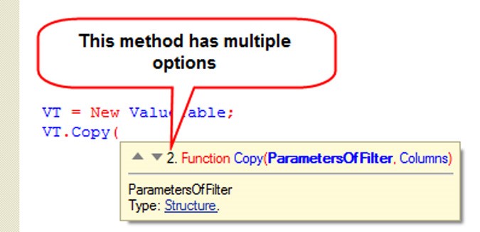
Fig. 342. Multiple syntax options in parameter context help
The type of value that can be passed to this parameter is displayed below the parameter description. If the value can have multiple types, these types are separated by a comma. Each type name is a hyperlink that you can click on to open the Syntax Assistant (see page 2-1170) and display the type information. Parameter context help is closed when you enter the ")" character or press Esc in the open parameter context help window.
If you want context help to display the parameter description and types for applied solution methods, add a comment based on specific rules prior to the method. In general, a procedure or function description contains the following sections:
Description section – contains a brief description of the procedure or function’s purpose and/or operation. In case of a function with no parameters, it can be the only section.
Parameters section – describes the procedure or function parameters. If no parameters exist, this section is skipped.
Returns section – describes the type and content of the returned value of the function. This section is not used for procedures.
Sample section – contains an example of using the procedure or function. Comments use the following common format:
<Comment>  =
[<HeaderSection>]
[<ParameterSection>]
[<ReturnedValueSection>]
[<SampleSection>]

<NewRow>  = Beginning of module row
<Name>  = 1C:Enterprise script ID
<Type>  = <Name> | <Name>"."<Name>
<TypeList>  = <Type>{","<Type>}
<StringOfText>  = A text line (without line breaks)
<Text>  = <StringOfText> {<NewRow> <StringOfText>}

<HeaderSection>  = [<Text>]

<ParameterSection>  = <NewRow> ("Parameters:") {<ParameterDescription>  {<TypeLongDescription>} }
<ParameterDescription>  = <NewRow> <Name> ["-" <TypeList>] "-"  [<Text>]
<TypeLongDescription>  = <NewRow> "-" <TypeList>] "-" [<Text>]

<ReturnedValueSection>  = <NewRow> ("Returns:") <ValueDescription>
<ValueDescription>  = <NewRow> [<TypeList> "-"] [<Text>]

<SampleSection>  = <NewRow> ("Sample:") <NewRow> <Text>
A comment preceding a procedure or function and using the described format results in the correct display of a tip for an applied solution method in the context help for method parameters.

Fig. 343. Context tip for the parameters of applied solution methods
Thus, the context tip mechanism in the 1C:Enterprise system text editor is a rapid and proper way to enter module texts.
26.2.1.6. Module Syntax Check
A module being edited can be checked for correct use of the 1C:Enterprise script syntax.
To check syntax in the module use the Text – Check Syntax item.
Syntax is checked in the following order:
common modules
managed application module
object module
form module
Module control is performed if the module has not been validated or has been modified.
When module control is being processed, only modules placed in the list before the current module are checked. For example, when checking the application module, only common modules are checked. External connection module is checked only when it is being edited.
When errors occur, a list of errors is opened in the message window along with a complete location address and error description. The cursor, when pointing to the line containing the error message, takes the magnifying glass form. To go to the module line that caused the error, double-click on the message. If the module containing the error is closed, it opens automatically.
If no errors have been found, the message window displays a message indicating there are no errors in the module.
In the Designer parameter setup mode (Tools – Options item, Modules tab, Check tab, Check automatically check box) the automatic module check mode can be enabled. If the module has been changed, module syntax check is performed when closing the module window or saving the configuration.
The automatic check mode should be used when debugging any configuration item.
For complete check syntax of all configuration modules in a single operation, select Configuration – Check Syntax in Modules.
Tips on the 1C:Enterprise script are available in the module error correction process. To access the tips open the Syntax Assistant and find description of the applicable script item (see page 2-1170).
Tooltip on a particular 1C:Enterprise script item (operator, procedure, function, property or method) can be accessed by placing the cursor in the module on the appropriate item and pressing Ctrl + F1. Description for the selected 1C:Enterprise script item is opened in the Syntax Assistant.
26.2.1.7. Configuration Module Access Restrictions
Passwords can be set up for some modules. The main purpose of the password is copyright protection for the configuration developers.
The following restrictions apply to passwords:
managed application module is not protected;
form modules are not protected;
command modules are not protected;
modules containing preprocessor directives are not protected;
common client modules operating in the managed mode (thin client, web client and thick client in the managed mode) are not protected.
Setting Access Password
To set up a password open the applicable module and choose the Text – Set Password command. The item is available if the module is open for writing.
If the module contains preprocessor instructions, the program displays a warning: Protected module must not contain preprocessor directives. Continue? Clicking No does not set up the password. Clicking Yes makes password setup possible and implies that directives are to be deleted in the future. If the directives are not deleted, the system issues the warning: Compilation error: Module <module name>. Source module code is unavailable and compiled image is missing.
Password dialog appears on the screen.
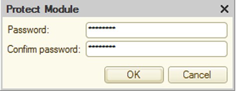
Fig. 344. Module Password Setup
Enter the password and confirm it. To set up the password click OK; to cancel the setup click Cancel.
Opening a Protected Module
If a module is password-protected, when attempting to open the module, a password entry dialog appears.
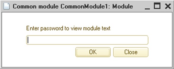
Fig. 345. Opening a Password-Protected Module
If the password is correct, the module is opened. If the password is incorrect, the Incorrect password warning appears and the module does not open.
Password Change
To change the password, open the module and choose the Text – Set Password command. Password dialog appears on the screen. Enter the old password. If you entered the password correctly, the new password dialog box appears on the screen (see page 2-956).
To disable the password, clear the password text boxes and click the OK button without typing a password.
26.2.2. Editing Text Templates
If Text document is selected as the template type in the template wizard, the text editor is opened in text template input mode.
The text template editing mode is also available for text documents with the Text template extension.
26.2.2.1. Text Template Format
The entire template text is divided into areas. The areas have to follow each other and cannot overlap or include each other. Areas in the template text are identified as follows:
#Area  ÕÕÕÕÕ
#EndArea
where ÕÕÕÕÕ is the area name.
The area end need not be specified. Declaring the beginning of an area means that the previous area has ended.
For storing area variants in several languages, a language code can follow the area name:
#Area  Heading1 RU
#EndArea

#Area  Heading1 EN
#EndArea
If a language code is not indicated for any area variant, this area variant is returned when language code that is not indicated in any of the area description variants is transferred to the GetArea() method.
Each area consists of service and textual parts.
#Area  ÕÕÕÕÕ

[service  part]
[text  part]

#EndArea
26.2.2.2. Service Part of an Area
The service part has no visible borders. It contains all lines from the area beginning that start with the special "#" character. Text template fields used inside the area are described in this part. If not needed, the service part can be left out.
Text template directives are highlighted in color.
Area Service Part Structure
The service part of an area consists of some common area parameters and format descriptions for fields included in the area. All descriptions in the service part apply only within the area. If field format is described in some area and the field occurs in another area without a format description, the default format is used.
A common area #ReplaceChar A B keyword can be located at the beginning of the service part. This keyword is used to replace characters inside the area lines.
A – character to be replaced; B – character replacing A.
Characters must be enclosed in single quotes.
For example, if #ReplaceChar "@" "#" is written, the "@" character not included in the field names inside the lines are replaced with "#".
It makes sense to use this keyword in cases when the format of a template string must contain the # character (using it directly would mark the text as service). Field Descriptions
Replacement description is followed by format description for fields used in the area.
A field is created using the #Field FFFF keyword, where FFFF is the field name for which format is to be described.
Subsequent lines contain keywords for the field description. The field description applies up to the beginning of the next field description.
#Alignment {Left | Right | Center | Justify} – shows field alignment within its space limits.
#Field  WorkType
#Alignment  Justify
#Format <Format string> – specifies format string for field output.
#Field  Date1
#Format  "DF=dd.MM.yy"
#Field  Tm1
#Format  "ND=4; NFD=0; NDS=."
#Block <Parameter> – shows the necessity of filling the area for the field by "#" characters. If <Parameter> = True and field contents do not fit in the allocated place, the area is filled.
#Field  ReportTotal
#Format  "ND=18; NFD=2; NDS=."
#Block  True
26.2.2.3. Text Part of an Area
The text part of an area consists essentially of the text template strings. It begins after the last string belonging to the service part of the area and continues up to the end of the area. Field names can be specified inside the lines of the text template in the following format: [FFFF].
The number of spaces reserved for the field equals the number of characters displayed in the brackets (brackets included). If the field size consists of only one symbol, a single bracket can be used.
Example:
-----------------------------------------------------
![Name  ]! [Code ]! [Description ] !
-----------------------------------------------------
If the field name immediately follows the left bracket, then that field has a left alignment; if it is immediately followed by the right bracket, then it has a right alignment. If whitespaces are placed to the left and to the right of the field, it is centered inside the allocated spaces.
If the field name is larger than the assigned number of spaces, the name is displayed using the Fields keyword.
Example:
#Field  Number
#Format "ND=3; NFD=0"
#Field  Code
#Format "ND=5; NFD=0"
#Field  Label
#Format "ND=1"
-------------------------------------
![  ]! [ Code]![ Description ] ! [! #Field Number Label
-------------------------------------
Fields keyword parameters are only indicated for fields if their names are not enclosed in brackets inside the template body. Auto Wrap
If the text does not fit in the allocated field size, it may be necessary to use automatic text wrapping to a new line. To do this, it is recommended to use a field placement instruction in the template, using braces and angle brackets.
{FFFF} – field area is limited by braces. They show that the text stored in the FFFF field can be auto-wrapped to this line and indicate the area for the text that does not fit in the FFFF field. Even if the line does not need to output any of the fields, it is output anyway.
<FFFF> – field area is limited by angle brackets. They show that the text stored in the FFFF field can be auto-wrapped and indicate the area for the text that does not fit in the previous line of the FFFF field. If all the fields in the line are enclosed in angle brackets, but none of them has been used for text output, the line is not output. If the text still does not fit when output from the field to the line where the field in angle brackets is included, the line is duplicated until the entire text can be output from the field.
Example:
---------------------------------------------
![  YY]! [XX ]![ ZZ]!
!  ! {XX }! !
!  ! <XX >! !
---------------------------------------------
This example shows that the XX field is placed on the first line. The part of field XX that does not fit on the first line is placed on the second line. The part of field ÕÕ that did not fit on the first and second lines is placed on the third line. If field ÕÕ has no text left for the third line, that line is not output at all, but if it did have text left, the third line is output until the text from field XX ends.
26.2.2.4. Text Template Keyword Description
Area
Description:
This indicates the beginning of the template area, but if the previous area has not ended, it indicates the end of previous template area.
Syntax:
#Area <Area name> <Language code> Parameters:
<Area name> Required
Area name used to show the area using GetArea() text document method is indicated.
<Language code> Optional
The area language code is specified. If the multi-language configuration is to be used, then several areas with the same name can be displayed in the text template, but each area must contain a language code. If language code is not specified, this area is selected when an area with a language code that is missing from the area description is requested.
EndOfArea
Description:
This indicates the apparent end of the template area.
Syntax:
#EndArea
ReplaceChar
Description:
This keyword is used for character replacement inside the area lines.
Syntax:
#ReplaceChar <Character to be replaced> <Replacing character> Parameters:
<Character to be replaced> Required
The character to be replaced is enclosed in single quotes.
<Replacing character> Required
This indicates the character replacing <Character to be replaced>.
Field
Description:
This indicates the field that needs formatting keywords specified for it.
Syntax:
|
<Field name> Field name. Align Description: This indicates alignment for field contents output. Syntax: #Alignment <Alignment parameter> Parameters: |
Required |
|
<Alignment parameter> |
Required |
#Field
<Field name> Parameters:
Field alignment value. The following values are available:
Left
Right
Center
Justify
Format
Description:
This indicates the field display format.
Syntax:
#Format <Format string> Parameters:
<Format string> Required
It defines the field value presentation format.
Example:
"DF=dd.MM.yy"
Block
Description:
If the parameter value is True and the field value does not fit within the allocated space, the entire space is filled with the "#" character.
Syntax:
#Block <Parameter> Parameters:
<Parameter> Optional
It defines the necessity of field filling. Available values:
True
False
Fields
Description:
It indicates a list of fields with names that cannot be indicated in their allotted area.
Syntax:
#Fields <Field name 1> <Field name 2> … <Field name N> Parameters:
<Field name> Required
Field name. All field names that are not indicated in the template text area should be specified.
26.2.2.5. Invoice Printing Example
It is assumed that the Document configuration object named Invoice contains the PrintText template in the text template list:
#Area  Header EN
Invoice N [DocumentNumber ]
From: [From ]
To: [To ]
=================================================
|  N| Description | Price |Pieces| Sum |
#Area  String EN
#Field Price
#Format "ND=10; NFD=2; NDS=."
#Field Pieces
#Alignment Right
#Format "ND=4; NFD=0; NDS=."
#Field Sum
#Format "ND=12; NFD=2; NDS=."
|--+---------------+----------+----+------------|
|[]|[Description  ]|[ Price]|[ ]|[ Sum]|#Field Number Pieces
|  |<Description >| | | |
#Area  Footer EN
#Field TotalPieces
#Alignment Right
#Format "ND=4; NFD=0; NDS=."
#Field TotalSum
#Alignment Right
#Format "ND=12; NFD=2; NDS=."
=================================================
Total [ ] [TotalSum] #Field TotalPieces

Director: [Director ]
The template contains the following fields:
Header – outputs the report header; String – output the tabular section; Footer – outputs totals.
The document form has a Print button. Clicking it invokes the Click() event with the handler procedure placed in the form module.
Procedure  PrintToText(Button)

CurDoc = New TextDocument();
PrintText(CurDoc);
CurDoc.Show();
EndProcedure
CurDoc text document is created during the procedure, and PrintText(CurDoc) procedure which fills the text document using the invoice data is called. The procedure is placed in the document module. The document is opened on the screen after it is filled.
PrintText() procedure text:
Procedure  PrintText(CurDoc) Export

// Get template
Template = GetTemplate("PrintText");
// Set language code
Template.TemplateLanguageCode = "RU";

// Header
Area = Template.GetArea("Header");
Area.Parameters.DocumentNumber = Number;
Area.Parameters.From = Format(Date,"DF=dd.MM.yyyy");
Area.Parameters.To = Contractor;
CurDoc.Output(Area);

// Process 'Contents' tabular section
StrTotal = New Structure("TotalPieces, TotalSum",0,0);
For Each StrContent From Content Do
Area = Template.GetArea("String");
Area.Parameters.Number = StrContent.StringNumber;
Area.Parameters.Description = StrContent.Nomenclature;
Area.Parameters.Pieces = StrContent.Count;
Area.Parameters.Price = StrContent.Price;
Area.Parameters.Sum = StrContent.Sum;
CurDoc.Output(Area);
StrTotal.TotalPieces = StrTotal.TotalPieces + StrTotal.Count;
StrTotal.TotalSum = StrTotal.TotalSum + StrTotal.Sum;
EndDo;

// Footer
Area = Template.GetArea("Footer");
Area.Parameters.Fill(StrTotal);
IR = InformationRegister.ResponsibleEmployees;
Area.Parameters.Director = IR.GetLast(Date).Director;
CurDoc.Output(Area);
EndProcedure
26.2.3. Editing Template Text
Besides the module text editor features, the template text editor allows creating and editing available templates (for details on templates see page 2-1160).
26.2.4. Query Text Editor
In this mode the text editor has all the standard features, plus several important additional features.
Query language syntax is highlighted with color. For a description of query language constructs see page 1-442 or section "Work with Queries" in the 1C:Enterprise script help.
Editor commands are extended with commands for setting and clearing comments.
In the 1C:Enterprise mode, users with administrative permissions are given the opportunity to open the query wizard.
Besides query text, query texts can be edited for text documents with the enabled Query language extension and for text document fields with the enabled Query language extension.
26.3. CONFIGURATION COMMAND INTERFACE EDITOR
Configuration command interface editor can be used to set up initial order of sections in the sections panel (see page 1-85) and initial visibility based on roles.
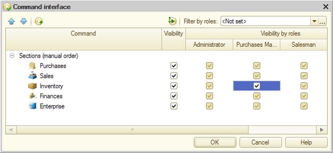
Fig. 346. Configuration Command Interface Editor
Command column can specify the order of sections.
Visibility and Visibility by roles columns are used to set default visibility for open subsystems commands.
26.3.1. General Rules for Setting Visibility
Table box contains a common visibility management column (Visibility column) and a set of columns matching the number of roles defined in the configuration.
Initially the command display order and visibility settings are set up by the system. You can set up visibility for all commands, as well as for specific commands selected by roles to which these commands are available.
Object visibility can be set up in the command interface using several methods:
Editing the Visibility column. In this case command visibility is set up for all roles. Command visibility for a particular role is defined by the Visibility column if a special visibility management box status is selected for the role (see example of Sales subsystem visibility on fig. 346).
Selecting a specific visibility value (checked or unchecked) for a particular role indicates whether the command is visible by default (or hidden – depending on the check box status) for the role. Common status (Visibility column) is ignored in this case. Thus, fig. 346 demonstrates that Goods inventory section visibility for the Administrator role is disabled (though common visibility box is checked) and command for navigation to the Enterprise subsystem for the Sales manager role is visible by default (though default visibility for this section is disabled).
Visibility status can be changed for multiple commands from the list.
To show only visible commands in the Command list press the Hide invisible by default button.
26.3.2. Filter by Roles
In the Filter by roles field you can specify several roles that will define the current display of the command list. Only commands available to these roles will be included in the list. To disable filtering select Not set. The selection list allows the user to enable one of the latest filters quickly.
26.4. START PAGE WORK AREA EDITOR
This editor can be used to set up a general layout of forms on the start page as well as the list of forms that can be displayed on the start page.

Fig. 347. Start Page Work Area Editor
The user can select a general layout of forms on the Start page in the Starting page template field:
One column – the start page displays forms in a single column.
Two columns, same width – the start page displays forms in two columns of equal width.
Two columns, different width (2:1) – the start page displays forms in two columns and the left column is twice as wide as the right one.
After the required forms have been selected, the user can specify their sequence order on the start page and height for each form (Height column).
Visibility editor is similar to other role-based properties editors (see page 2-942).
As the user develops the start page interface, he/she should pay particular attention to placing the most important forms on the start page. These are forms that are most frequently used by users with a particular set of roles.
Please remember that forms that cannot be viewed by the user due to insufficient rights are not displayed on the start page regardless of the Visibility column status.
26.5. MAIN SECTION COMMAND INTERFACE EDITOR
This editor can be used to set up commands in each command bar, their display order and visibility of command interface items based on roles.
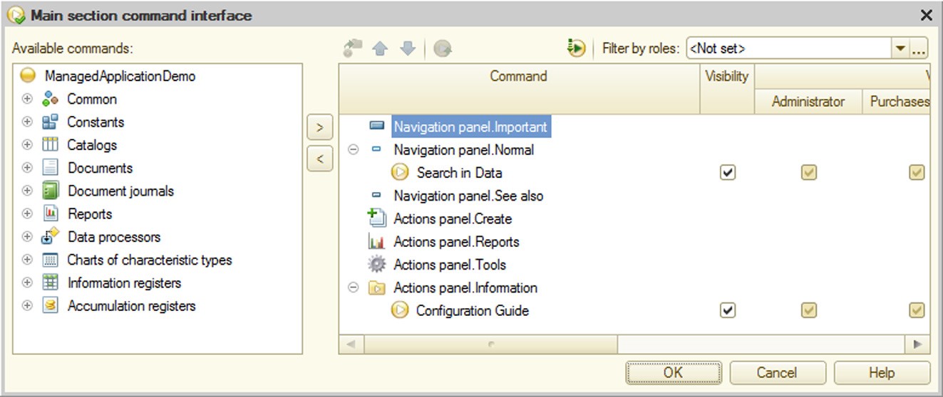
Fig. 348. Main Section Command Interface Editor
The editor includes two table boxes. The one on the right is used to edit the command interface; the one on the left contains a hierarchical list of available configuration commands that can be added to the main section interface. Commands in the Available commands list meet the following requirements:
They have no parameters.
Groups indicated for commands belong to the navigation or action panel. The Command column of the interface editor table box displays structure of commands grouped by action panel categories (Important, Normal, See also), navigation panel categories (Create, Reports, Tools) and categories of commands defined in the metadata tree branch Common – Command groups. The table box also contains the Visibility column. The system also creates command visibility columns for each role defined in the configuration.
To select the required command expand the appropriate branch in the available commands table and pick a command.
To move the command to the command interface select it and click Add command to main section (alternatively, press Enter or double-click the command line). The selected command is moved to the panel and group defined for the command during setup of the current metadata object (Group property). If the Add command to main section button is unavailable, the selected command cannot be moved to the desktop. For example, it could happen if the Include in the command interface property is not set for the enumeration.
Initial order of command display in the main section command interface and visibility settings are set up by the system. The user can set up visibility for all commands as well as for specific commands selected by roles to which these commands are available.
Move a command button can be used for moving commands between groups. Commands can also be dragged to the required position within groups of a single panel. To set up command order in a group use up and down buttons.
Pressing the Set default properties button resets the command visibility settings and group membership to the default system settings.
If the configuration has no subsystems, the editor looks differently:
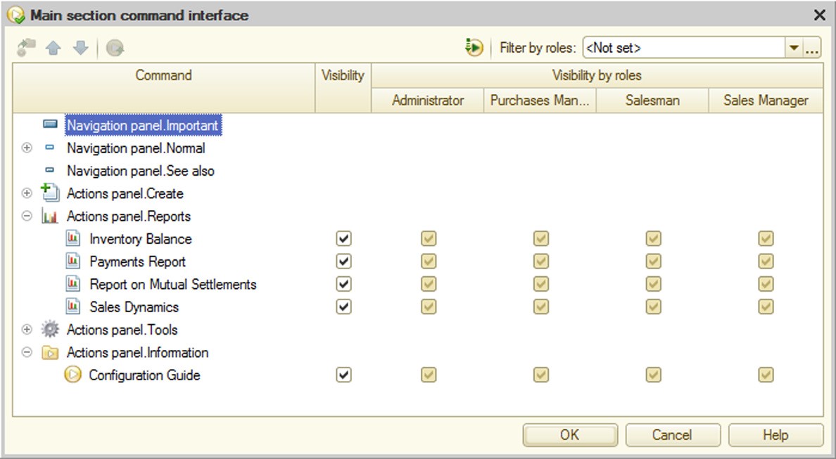
Fig. 349. No Subsystems
In this case all system commands are available on the desktop and the user only has to set their default visibility.
For rules of visibility management see page 2-966. For a description of filtering by roles see page 2-967.
26.6. COMMAND INTERFACE EDITOR
The command interface editor can be used to set up commands in each command bar, their display order and visibility of command interface items based on roles.
The first (leftmost) column of the table box displays a complete list of commands grouped by categories (both system categories Important, Normal, See also, Reports, Tools, etc. and categories defined in the metadata tree branch Command groups) of the action and navigation panels. This is followed by the column that manages general visibility of commands.

Fig. 350. Command Interface Editor
The system sets up the command order automatically. If manual setup of the command display order is required, use buttons to move the commands up and down or drag them. In this case a line saying (manual order) is displayed next to the group. To undo the order changes select Restore automatic order in the group context menu.
Move a command button can be used for moving commands between groups. Commands can also be dragged to the required position within groups of a single panel. To set up command order in a group use up and down buttons.
Pressing the Set default properties button resets the command visibility settings and group membership to the default system settings.
For rules of visibility management see page 2-966. For a description of filtering by roles see page 2-967.
26.7. ALL SUBSYSTEMS EDITOR
All Subsystems editor is designed to facilitate solving the following tasks:
editing command interface for any subsystem
setting contents and properties for any subsystem
setting up order of subsystems
editing contents of subsystems
NOTE
The subsystem command interface editor can also be opened from the Command interface subsystem property using the Open link.
The Subsystems list defines the order of subsystems in the configuration tree. This order does not affect the order of subsystems in the sectionsections panel.

Fig. 351. All Subsystems Editor
To set up subsystem order in the sections panel, go to the root item in the Subsystems list and set up the subsystem order.
Subsystem properties can be edited in the properties palette or subsystems editor (select the subsystems and click Change current item).
To move a subsystem (together with subordinate subsystems) select it and click Move subsystem. Use the selection window that opens to specify the destination subsystem for the current subsystem. Transfer to subsystems that belong to the current subsystem is not allowed.
For rules of visibility management see page 2-966. For a description of filtering by roles see page 2-967.
26.7.1. Subsystem Contents Setup
The subsystems list is followed by the Content hierarchical list that is used to define contents of metadata for the current subsystem. Please note that the displayed contents do not include metadata of subordinate subsystems if no metadata are defined in these subsystems.
To modify the contents click Edit subsystem content. It opens the object selection window with the metadata tree. Objects with selected check boxes are included in the subsystem.
Use the selection window to pick the object to be included in the subsystem contents. Click OK to close the selection window and generate the subsystem contents.
26.7.2. Subsystem Command Interface Settings
Subsystem command interface can be set up in the table box to the right of the subsystems and commands lists.
For rules of visibility management see page 2-966. For a description of filtering by roles see page 2-967.
26.8. QUERY WIZARD
The Query Wizard enables you to write query code in a module and edit existing queries.
To call the Query Wizard open a module, select the procedure that is to contain the query, place the cursor in the part of the procedure where the query code is or should be located and select Text – Query Builder.
If there is no query, the user is prompted: Query text not found. Create new query? Clicking Yes displays the Query builder window. If you are editing a query, the Query builder window containing the data of the current query appears.
The list of objects can be sorted using the Sort the list button above the Database list. Pressing the button again cancels the ordering.
You can use the Display change tables button to display change tables for the configuration objects in the object list as a separate Constants (Changes) branch. Pressing the button again hides the branch.
Click Create a nested query to create a nested query (see fig. 352). Compile the required query in the query wizard that appears and click OK. The nested query will be displayed in the Tables list.
Click Create a temporary table description to use the created temporary table (see fig. 352). In the displayed form, enter the table name and names of the required fields and specify the field value type, if necessary.
Fig. 352. Query Wizard in Report Generator
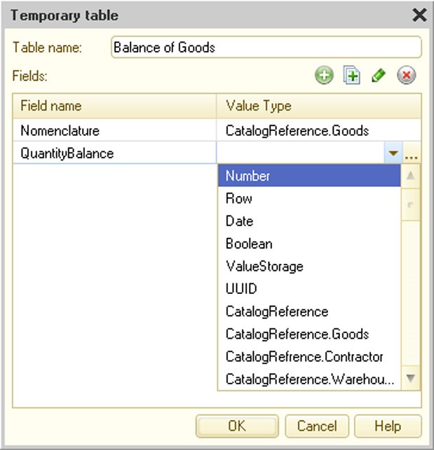
Fig. 353. Temporary Table Description
Using the Next > buttons in the query wizard work your way through the tabs and select the necessary source data, specify groups and conditions, set the desired order and describe the resulting data. The wizard will create a form and template which will be placed on the appropriate branches. Using the Query button you can open a window with the text of the query generated from the specified data at any time.
To correct the data use the < Back button.
Select the required objects in the Tables and fields tab and move them to the Tables and Fields sections.
To specify additional criteria you can use the custom expression generation mode in your query. To do so, select Add from the Fields list context menu. A custom expression window appears on the screen.

Fig. 354. Custom Expression Wizard
The expression text is generated in the lower box. You can enter the expression with the keyboard. For convenience in entering the names of attributes, you can drag the desired fields from the fields list and select the desired query language functions from the list by dragging them with the mouse to the expression text box as well.
The wizard will also have the Links tab if you specify several tables.

Fig. 355. Define Link Conditions for Tables
The Links tab enables you to specify the criteria for the links between the table fields. Click Add to enter a new criterion and select one of the tables from the Table1 column; from the Table2 column select the table whose fields are linked with those of the first table. Controls that are used to create table link criteria are located below the criteria list.
On the Grouping tab, if necessary, select the attributes by which items are to be grouped.
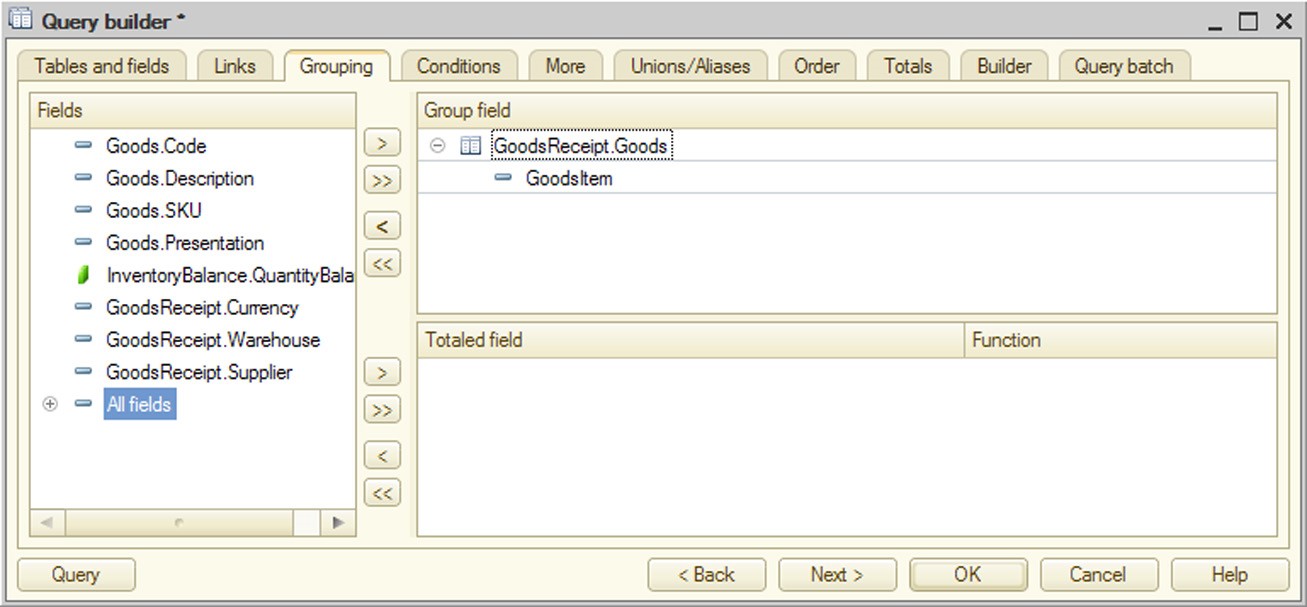
Fig. 356. Query Result Groups
Specify conditions for source data filtering at the Conditions tab.

Fig. 357. Query Conditions
Choose a condition for each selected field (for a custom condition, set the check box in the Arbitrary column). If the check box is not set, select condition type and specify parameter description. If the Arbitrary check box is set, you can use the custom expression generation window (see above).
Specify any additional criteria on the More tab.
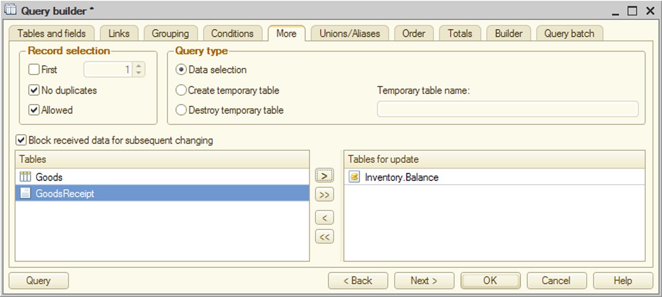
Fig. 358. Additional Query Parameters
If temporary table creation has been selected on the More tab, fields to be used as a basis for index can be picked on the displayed Index tab.
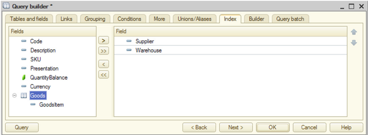
Fig. 359. Temporary Table Index
On the Unions/Aliases tab, enter field aliases if necessary (see fig. 360).
The table shows the mapping between the selected fields and source data. You can change field names and mappings. To change the name select the field and press Enter. Then enter the new field name. To change the mapping select the desired row in the Query column and press Enter. Select the desired value in the dropdown list.
If you need to select only unique values, check the box in the No duplicates column.
Aliases for fields that have been changed by the user, loaded from the query text or assigned mandatory aliases by the wizard at the alias generation step are displayed in bold.
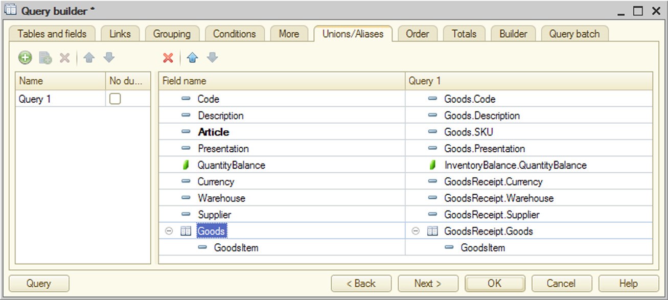
Fig. 360. Query Unions/Aliases
Specify the result output order on the Order tab (if necessary).
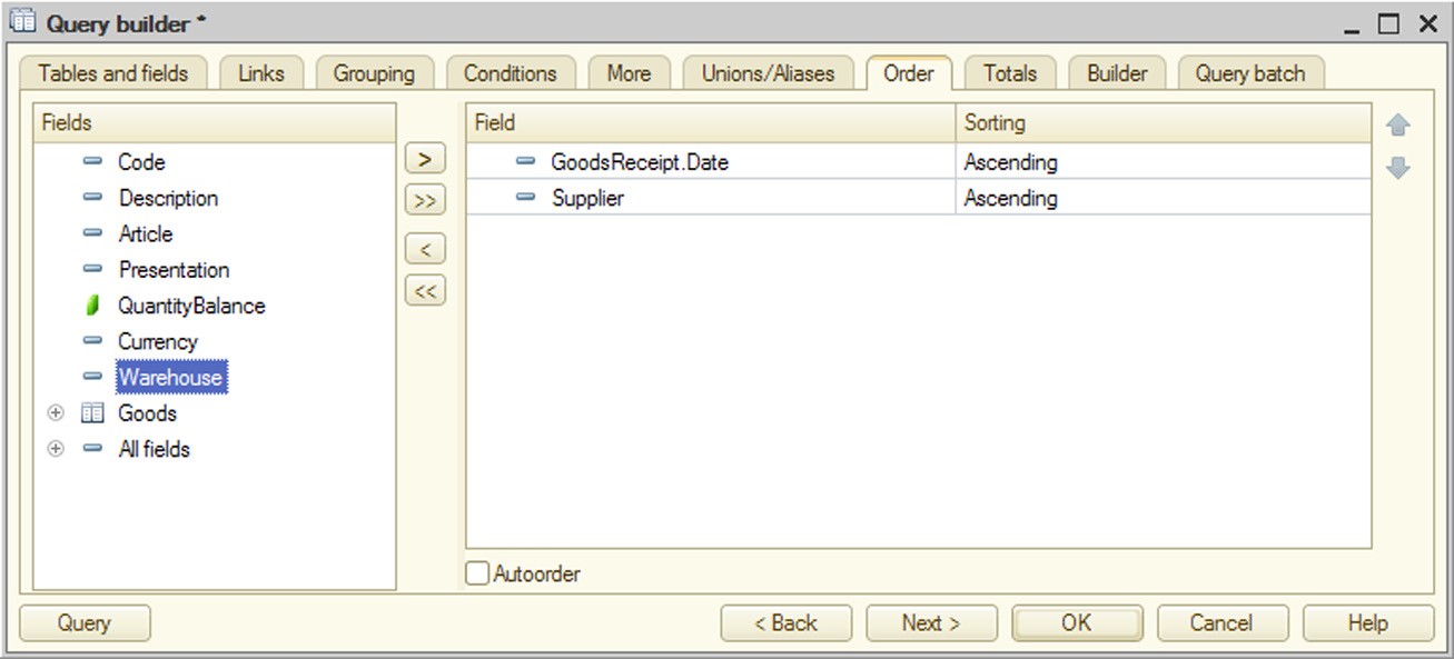
Fig. 361. Query Result Ordering Setup
As you can see in fig. 361, the user has selected to output data sorted by date, while within a single date sorting by Vendor is used.
On the Totals tab, if necessary, specify which fields should be subtotaled and whether overalls should be generated (see fig. 362).
If you press the >> button located next to the group fields, all reference fields are placed into the group fields. If you press the >> button located next to the totaled fields, all numerical type fields are placed into the list of totaled fields.

Fig. 362. Setting Totals for Query Result
The report builder settings are provided in the Builder tab. Select tables and fields, specify conditions, order of presentation, and describe the total data.
The Tables tab can be used to edit parameters of virtual table report builder and mark optional tables. To edit virtual table parameters select the table that requires parameter setup, call the Virtual table parameters command and enter the table parameters required for the report builder into the new dialog box. To mark an optional table clear the Required check box for the appropriate table. For a group of optional tables you can also specify its number. Optional tables with matching group numbers and adjacent link listing are combined into one optional group. Optional tables with different group numbers are separated into different groups.
The Fields tab can be used to select the fields that the report builder uses as available fields in the report output.
The Conditions tab can be used to select the fields that the report builder uses as available fields for filtering.
The Order tab can be used to select the fields that the report builder uses as available fields to sort the results.
The Totals tab can be used to select the fields that the report builder uses as available fields for report grouping.
The Query batch tab enables the user to create a succession of batch queries when working with batch queries. Each query can be edited and configured in the same window and all previous tabs allow switching between the queries being configured (see fig. 363).
Clicking OK in the program module generates query text. If the wizard attempts to open invalid query text, the cursor is automatically placed in the query line containing the error and a troubleshooting message is displayed.
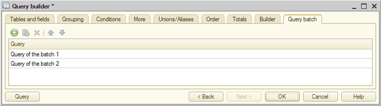
Fig. 363. Query Batch
Depending on the source of query wizard call (data composition system, query with result processing, etc.), the wizard form can have new tabs that are described in the calling mechanism description.
26.9. QUERY WIZARD WITH RESULT PROCESSING
This wizard is designed to generate code for query result processing. This wizard helps create the following versions of query result processing procedure:
standard iteration over query results
outputting results to a spreadsheet document
outputting results to a plan
To call the wizard use the Query Wizard with result processing context menu item in the module editor.
When called the wizard looks for some wizard-created code in the current line. If the code can be found, the wizard loads it (including template names etc.).
In this case query wizard window is different from the query editor described above (see page 2-937).

Fig. 364. Query Wizard with Result Processing
If the wizard is opened in this mode:
Query result processing type is selected at the Result handling tab:
○ Result iteration;
○ Output to spreadsheet document;
○ Output to chart;
If Output to spreadsheet document or Output to chart is selected, parameters for output into these objects are displayed.
Clicking OK generates the code to be inserted in the current module position. If the wizard has been called for the existing code, the old code is replaced.
When outputting to a spreadsheet document a template is created in the metadata object whose object or form module has called the document. It is also modified if the wizard is invoked again. This template is removed if the wizard has been used to create the spreadsheet document and is now called to generate another method of query result processing. If the wizard is called in a common module, a common template is created.
NOTE
If the configuration editing mode is set for modes of managed application startup, report generator cannot be invoked from the metadata object menu.
26.10. REGISTER RECORD WIZARD
Use the register record wizard for documents.
To launch the register record wizard, go to the Posting tab in a document editing window, specify the list of registers that will be affected by the document and press the Register records wizard button. If a list of records for at least one register is defined for the selected document, this item is available in the context menu.
When launched the wizard asks the user to select a register for which a Posting() procedure is generated and opens the wizard window (see fig. 365).
Initially, the list contains only the specified register. You can change the list by adding registers from the list of registers marked on the Posting tab of the document editing window.
Preliminary settings must be specified for each register (depending on its type).
For balance accumulation registers, specify the type of register records.
For accounting registers that do not support correspondence, specify the correspondence type and the account; for those that do support correspondence, specify the debit and credit accounts.
Initially, the list contains only the specified register. You can change the list by adding registers from the list of registers marked on the Posting tab of the document editing window.
Preliminary settings must be specified for each register (depending on its type).
For balance accumulation registers, specify the type of register records.

Fig. 365. Register Record Wizard
For accounting registers that do not support correspondence, specify the correspondence type and the account; for those that do support correspondence, specify the debit and credit accounts.
If a document has tabular sections and their data must affect the status of registers, include the tabular section in the Tabular Section selection list.
Then fill the attribute formulas for each register using the data from the document attributes.
In the list of formulas, place formulas that define how to calculate register records from the selected document attributes.
You can create these formulas "manually" as follows. Enter the formula in the Expression column for each register attribute selected in the list. You can type it manually in this box or manually edit an existing formula there. The wizard does not verify the formula accuracy.
You can also insert data of the corresponding attribute into a formula by doubleclicking in the document attribute list. The wizard does not check the agreement of selected attribute types.
If at least one type belongs both to the register and to the register dimension/ resource and their names match, autofilling can be used for these subordinate objects. When you press the Fill Expressions button, names of attributes are entered in the Expression column and can be edited.
The wizard creates a Posting() procedure in the object module. The wizard displays the following warning at the beginning of the procedure: This fragment was built by the wizard. Warning! All manually made changes will be lost next time you use the wizard.
26.11. PRINT WIZARD
The print wizard is designed to create a template with specified named areas and print procedures for a configuration object.
The print wizard works with the following configuration objects:
catalogs
documents
document journals
charts of characteristic types
charts of accounts
charts of calculations
exchange plans
Basic techniques for working with the print wizard are discussed below using the example of working with a catalog. For other configuration object types, there may be some differences in working with the wizard.
To start up the print wizard point to the desired object in the Configuration window. Select Wizards – Print Design Wizard in the context menu.
Because the result of the print wizard operation is a print routine located in an object manager module, the wizard begins by checking the accessibility of that module. If the object module has restricted access, a password dialog box appears. After you enter the password, the wizard window appears.

Fig. 366. Select Behavior Option
First, the wizard prompts to select the startup option for which the print module is to be generated.
Then it asks the user to create a new print command or modify an existing command. Name must be specified for a new command. The default command name is Print. The specified name is subsequently used as:
object command name;
command module server method name;
method name in an object manager that implements the print procedure.

Fig. 367. Print Command Creation
If the user chooses to edit an existing command, the following texts are replaced in the command module: CommandProcessing() handler, server method with the command name (Print() in this case), object manager module method with the command name and template.
After you press the Next > button, the wizard switches to selection of header attributes. Create the attribute list using the transfer buttons.
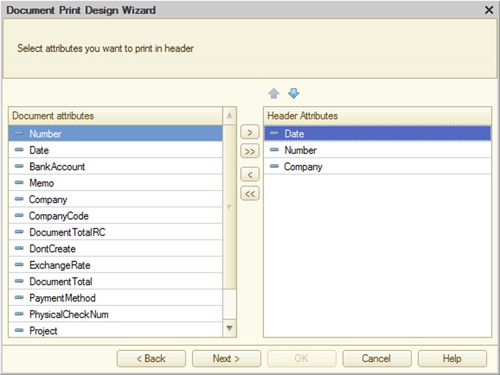
Fig. 368. Header Attribute Selection
If the configuration object has tabular sections, then after the Next > button is pressed the wizard switches to selecting attributes of the next tabular section. The print list is generated the same way as the header attribute list.
If the configuration object has tabular sections, then after the Next > button is pressed the wizard switches to selecting attributes of the footer.
Then the user should select the group for the created command and specify certain parameters of the generated document.
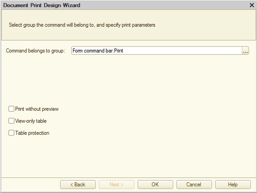
Fig. 369. Print Wizard Settings
Clicking OK closes the print wizard.
The wizard does the following:
Template template with a print form is created for the selected object (form name matches the created command name).
Command is created for the selected object; it prepares the spreadsheet document and calls the server procedure (with the command name) that fills the transferred spreadsheet document.
A procedure with parameters allowing to print multiple objects (a list) at one time is generated in manager module of the selected object. The created command is assigned rights similar to the View right for the object that initiates wizard call.
26.12. GENERATION SETTINGS WIZARD
The "Generation settings" wizard makes it easier to develop a procedure to be used to generate a new object.
This wizard can be used for the following objects:
catalogs
documents
charts of characteristic types
charts of accounts
charts of calculation types
exchange plans
business processes
tasks
To launch the wizard point to the desired object in the Configuration window. Select Wizards – 'Generate' Wizard in the context menu. If "Generate" mode is defined for the selected configuration object, this item is available in the context menu.
When you launch it, the "Create Based On…" Wizard window opens.

Fig. 370. Create based on Wizard
In the upper part you can see a list of base objects and a list of attributes for the base object selected in the first list.
The lower part displays a list of attributes for the resulting object.
The object attribute list must be supplemented with formulas to specify how the document attributes are filled from the selected attributes for the base object.
These formulas can be created "manually" as follows. A formula is defined in the attribute entry Formula text box for the attribute of the object selected in the list. Formula can be manually entered or edited in this box. The wizard does not verify the formula accuracy.
By double clicking in the list of attributes of the base object you can also insert correctly represented data of the corresponding attribute in the attribute entry Formula text box. The wizard does not check the agreement of selected attribute types.
You can also combine these two methods: when placed in the text box, data from the list of attributes of the base objects do not replace all of the information already there, just the selected characters.
Clicking the Fill Expressions button after request and confirmation creates filling formulas for base object attributes. Auto-filling does not change the previously filled formulas. Document attributes are matched with base object attributes according to the attribute names, IDs and types.
Clicking the Clear Expressions button after request and confirmation clears all formulas created both automatically and manually.
When formulas are created for a base object selected from the base object list, they are retained in memory when a different base object is selected. So without ending the wizard session, you can create "Create-on-basis" procedures for several base documents. You can also resume editing the procedure for any base object by selecting it in the list again.
To end your wizard session use the OK or Cancel buttons (with and without saving your changes, respectively).
The Refresh button allows you to see your changes in the form module without leaving the wizard window.
The wizard creates a Filling() procedure in the object module. The wizard displays the following warning at the beginning of the procedure: This fragment was built by the wizard. Warning! All manually made changes will be lost next time you use the wizard.
The next time the wizard is used, all formulas previously generated for any base document appear in the document attribute list when the corresponding base document is selected in the base document list. The wizard makes formulas generated in its previous session available for viewing and editing, both through the Fill Expressions and manually. Moreover, it also takes formulas entered manually into the document module into account if they are placed in the procedure it generates. The wizard does not check the correctness of these formulas. For example, if filling with two different base document attributes is specified for a document attribute, the wizard selects one for display (by alphabet). This is the one that remains in the module after the wizard results are updated. The second line corresponding to the same attribute is deleted.
26.13. CONFIGURATION OBJECT FORM WIZARD
The Form Wizard is launched whenever a new form is added to any configuration object that can include a subordinate Form type object. This special wizard is used to select the form type and set the configuration object attributes. The wizards have a great deal in common, despite substantial differences between the types of objects for which forms are created. Therefore, the use of form wizards will be demonstrated using the document form wizard as an example.
When creating a new form object, the screen displays the form wizard.
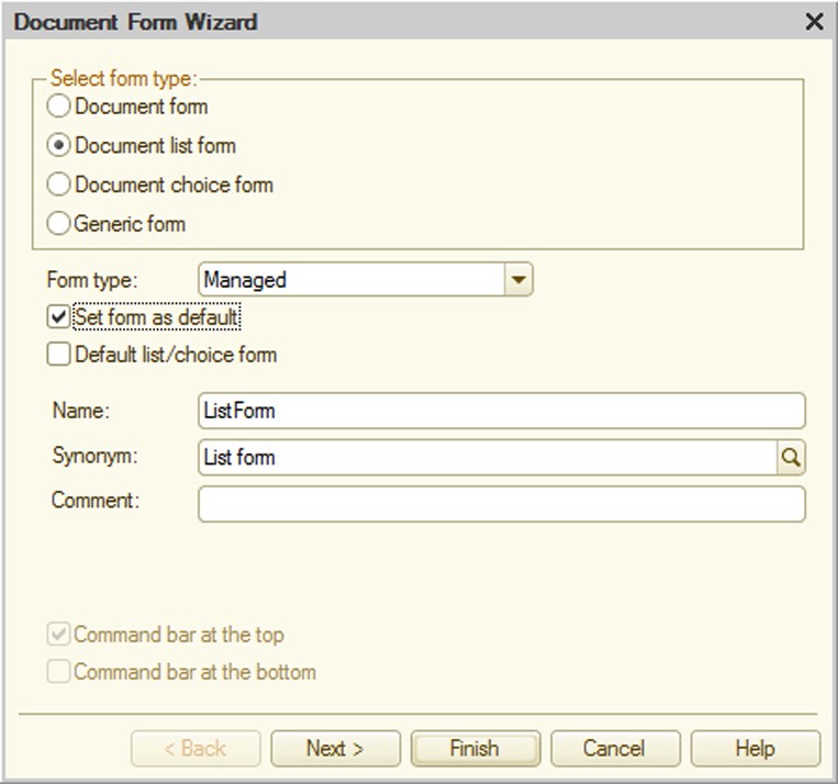
Fig. 371. Form Wizard
The selections available under Select form type depend on the type of object for which the form is being created. The following forms can be created for the Document configuration object:
document form
document list form
document selection form
generic form (blank form)
The number of forms for each type is unlimited. If the object has multiple forms of the same type, you can choose one of them as the default form. When you open an object without specifying explicitly which form to call, the default form opens.
To set a form as the default place a check mark in the Set form as default check box in the wizard. The default form can be changed later, on the Forms tab in the object editing dialog box (see page 1-59).
Selecting the Generic form type does not result in creation of a main attribute. In this case the form behaves in the normal manner. Selecting another form type results in creation of a main attribute and sets a different form type behavior. These exceptions are defined in objects known as form extensions (see descriptions of relevant object in the 1C:Enterprise script help).
Form type selection determines the main attribute type and consequently the entire form behavior, including the available toolbar commands.
Specify the form name, synonym and comment.
The functions of the command bars are determined by the action source and type of the form main attribute.
When the Finish button is hit, the wizard automatically places the controls in the form and opens it for editing.
If form attributes have to be changed, click the Next > button. The attribute set depends on the main form attribute.

Fig. 372. Form Attribute Selection
The attributes to be placed in the form are chosen at this point in the wizard. Selections are made in the Attributes column by checking the box to the left of the entry.
IMPORTANT!
The form wizard does not include non-displayable attribute types (such as ValueStorage) in the list.
26.13.1. Constant Form Wizard Features
Each constant can have its own editing form. To create this form select Create Constant Form in the context menu of the relevant constant.
Fig. 373. Creation of Constant Editing Form
Executing this command opens the common form wizard that lists all system constants as data and the current constant is the only selected attribute (by default).
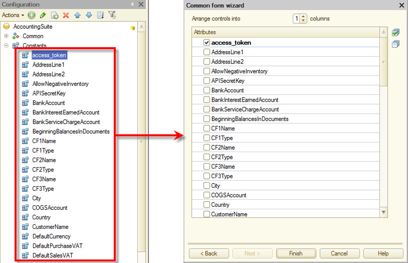
Fig. 374. Selection of Editable Constants
This form is also auto-generated by the system if the constant has its Default Form property non-filled and its Include in the command interface property filled.
To create an editing form for multiple constants create a common Constants form first and then select the constants to be edited in the attribute selection page.
Constant forms belong to the command interface of the subsystems that own the constant (if the Include in the command interface property is set for the constant) and the common constant editing form (if the Include in the command interface property is set for the common form).
If an editing form is created for the constant with the specified Include in the command interface property, the common form wizard clears the Include in the command interface property for the form. Therefore, the constant editing form is only included in the command interfaces of the subsystems that own the constant.
26.14. TEMPLATE WIZARD
Use the template wizard to create configuration object templates and common templates.
The wizard window appears when you select Actions – Add if the branch of the subordinate Templates or Common templates object is selected.
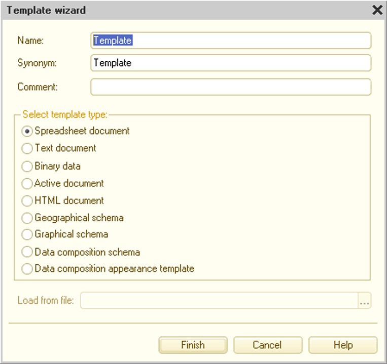
Fig. 375. Template Wizard
Specify name, synonym and comment and select template type.
The Spreadsheet document type assumes you use standard 1C:Enterprise system method to create and use spreadsheet document templates.
Selecting the Text document type assumes you use text documents specially prepared as templates. For a text document, the Extension property is set to Text template.
Selecting the Binary data type means that the configuration developer knows how to work with this type of object.
Selecting the Active document type enables you to use the OLE active document technology. If you press Finish, the wizard searches for available Active document types and offers to select one of those it finds.
Fig. 376. Active document Insertion
You can select a ready Active document and use it as a basis for template creation (load template prototype from a file). If you have selected a file whose type is not on the list of supported Active documents, the wizard displays a warning.
Selected document is saved in the configuration. Working with the template, you must use properties and methods provided by the selected platform.
If you select the HTML document type, the HTML template editor opens. This mode supports all features of the HTML editor. In addition, the HTML template editor enables you to use pictures from the picture library, from a file, from clipart or from "internal" pictures. Internal pictures are those already selected from a picture file and stored "inside" the template. To place a picture in a template, select Element – Picture.
Fig. 377. Picture Insertion
To select a picture press the selection button. Select the required picture in the window that opens.
Fig. 378. Picture Selection
The Geographical schema type allows you to create templates using documents prepared with the geographical schema editor.
If the Graphical schema type is selected, the user can use graphical schemas prepared in the graphical schema editor or load schemas from files and use them as templates.
Selecting the Data composition schema type opens the data composition schema wizard (see page 1-547).
If the Data composition appearance template type is selected, the appearance template wizard window appears (see page 1-622).
26.15. FORMAT STRING WIZARD
Use the format string wizard to write expressions using numeric, date and logical expression representations.
To open the wizard place the cursor over the required module text area and choose the Text – Format String Wizard item. The editor displays the following message for the new string: Format string not found. Create new format string? Clicking Yes displays the wizard window.
The wizard can also be invoked from Format and Edit Format properties of form element. In this case click the selection button in the appropriate property.
Window tabs correspond to the data type of the format string to be generated in the window.
Controls for selecting the presentation format are located on three tabs, according to the data types:
number
date
logical values
Language (Country) field (L parameter) defines information presentation based on the regional settings. Values specified in the following tabs override the country settings.
Select the Number tab for numbers.
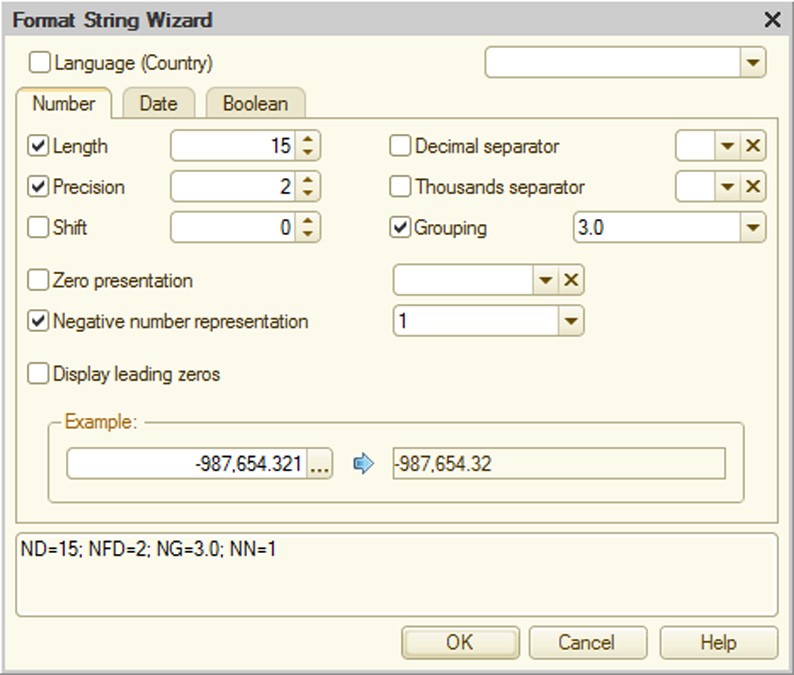
Fig. 379. Format String Wizard for Numbers
Length field (ND parameter) specifies the total number of decimal places (for the integer and fractional parts). Precision field (NFD parameter) states the number of decimal places in the fractional part.
Shift field (NS parameter) specifies the digit shift. A positive value results in division by 10 to the corresponding power and multiplication is performed if negative.
Decimal separator field (NDS parameter) specifies the decimal separator.
Thousands separator field (NGS parameter) specifies the thousands separator. When separator is set to an empty string, non-breaking space is used as a separator.
Grouping field (NG parameter) specifies the option for grouping digits in the integer part of a number.
Zero presentation field (NZ parameter) is used to select how zero values are represented. This parameter can be used in a format string, but it is not used for text boxes.
Negative number representation field (NN parameter) specifies how negative numbers are represented.
Leading zeros are displayed when Display leading zeros (NLZ parameter) is selected.
TIP
The bottom part of the wizard window displays format string results (Example group) and the format string itself.
Select the Date tab for dates.

Fig. 380. Format String Wizard for Dates
The date presentation option is selected in the Date format field (DF parameter).
The local date presentation option is selected in the Local date format field (DLF parameter). DD parameter value is not allowed for text boxes.
Empty date presentation field (DE parameter) is used to select an empty date presentation option. This parameter can be used in a format string, but it is not used for text boxes.
TIP
The bottom part of the wizard window displays format string results (Example group) and the format string itself.
For Boolean type data select the Boolean tab (see fig. 381).
If a value is not selected, default settings are used.
For details on format string parameters see a description of the Format String parameter for the Format() method in the 1C:Enterprise script description.
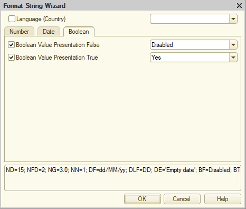
Fig. 381. Format String Wizard for Logical Value
If the format string wizard is used, the generated format string is inserted into the text (or text box) when clicking OK.
TIP
The text editor can be used to place the cursor in the format string and edit it by selecting Text – Format String Wizard in the menu.
26.16. WIZARD FOR STRINGS IN DIFFERENT LANGUAGES
Use this wizard to edit strings in all configuration languages and other languages if their codes are included in the edited set, but not in the configuration.
The wizard produces the following string:
<language_code1> = <String_1>; <language_code2> = <String_2>;…
You can use the wizard to easily create the Source Line parameter for the global context function NStr().
To open the wizard place the cursor over the required module area and choose Text – Multilingual string wizard. The editor analyzes the module text where the cursor is located and, if the construct is found, opens the wizard window. If the construct is not found, the wizard informs the user about it (see fig. 382).
The wizard window contains as many text boxes as there are languages in the configuration.
Enter the text and press the OK button. The wizard produces the following string:
ru = 'Äîáðîå óòðî!'; en = 'Good Morning!'
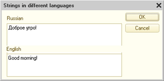
Fig. 382. Wizard for Strings in Different Languages
26.17. SPREADSHEET DOCUMENT EDITOR
The Spreadsheet Editor in 1C:Enterprise is used to create various print forms and forms for viewing and entering information in spreadsheet documents.
For a table of shortcuts for the spreadsheet editor see Help menu.
26.17.1. Spreadsheet Documents in 1C:Enterprise
Although 1C:Enterprise spreadsheets may be used for entering, processing and displaying information like standard spreadsheets (using spreadsheet documents in a form), they are mainly used to view processed information, e.g., a description of a printable report form. Program modules in the 1C:Enterprise system language are used to process information and place it on the spreadsheet for most configuration objects.
The 1C:Enterprise spreadsheet editor is used to work with spreadsheet documents and print form templates.
Generated spreadsheet documents can be saved to disk in various formats. If a document is saved in MXL, it can later be viewed in the file manager which is available at http://1c-dn.com/developer_tools/fileworkshop/.
Templates are stored in the configuration. There are common templates (located at Common – Common templates branch, e.g., templates of standard payment documents printed based on different documents) and templates for specific configuration objects (e.g., a fixed asset card). A configuration object may have several print form templates.
Spreadsheet documents may also be placed in a form. Use the Spreadsheet document field control for this purpose. In this mode other controls can be inserted into a spreadsheet document.
As far as the user is concerned, the templates and spreadsheet documents are practically identical.
Spreadsheet documents (files and templates) may be compared and merged.
26.17.2. Template
Templates can be created in the template wizard (see page 2-990) and the query wizard with result processing (see page 2-979).
26.17.2.1. General Principles of Template Design
Designing a template involves creating its components and building blocks (named areas) that constitute a ready-to-use output form (report). Since nearly all business documents have a rectangular structure, it is best to create templates for these documents in an editor that supports rectangular elements.
That feature is provided by the 1C:Enterprise spreadsheet editor. When creating a template, the following may be done: entering texts into spreadsheet cells; configuring formatting parameters (for the entire cell); modifying row height and column width; adding lines, rectangles and other graphical elements to templates (pictures, OLE objects and plans) and various controls; specifying appearance for the entire spreadsheet or separate cells and cell groups.
Please remember the following when creating a report template.
Virtually every report has a header which contains the report name and source parameters. These data are generally included in a named Header area. If a report contains a tabular section, the header usually contains column names.
Create named areas (Row in the example on fig. 384) for outputting information to spreadsheet. It is normally impossible to know the number of spreadsheet rows in a template; however, the structure of information is always the same. Therefore, the same areas should be used for each row when creating a report. Different parameters (Account, Description, Price, Total, etc. in the example below) should be assigned to cells for outputting specific information. First, values of these parameters are written for each row, then a new area is placed into the report. This procedure is repeated until all information on the spreadsheet is output.
A report usually ends with summary data and attributes of the responsible persons. This information is placed in the Footer area.
A finished template consists of several rectangular areas representing parts of the report: report header area (name, date, etc.), column header area, etc (see fig. 383).
The report generation procedure is described below.
Reports are always created as empty spreadsheet documents. Please note that a template is not directly linked with the finished report. A template is a wizard, a set of areas used by the program module to make a report.
When the report algorithm is processed, named areas are extracted from template in the required order, translated (parameters are replaced with values) and copied to the final report. The report language permits expansion of reports both horizontally and vertically.
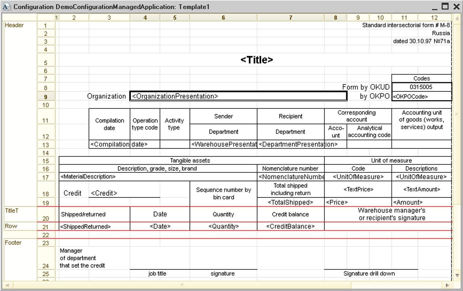
Fig. 383. Sample Template
26.17.2.2. Template Cell Properties
Template Property Category
The Template property category is shown if the Template option is turned on in the spreadsheet document properties.
The FillType property specifies what information is stored in a cell. This option is displayed if the Values category does not have the Contains Value option turned on. It does not change cell appearance and is used only during template processing when the final spreadsheet document is generated. This list contains the following items (see table below).
|
Data Format |
Details |
|
Text |
The cell contains text information which is to be moved into the final spreadsheet document from the template without any changes. |
|
Parameter |
Cell information is a parameter. The name of this parameter is specified in the Parameter property. |
|
Template |
Cell contains text with parameter names in brackets. When a spreadsheet document is generated, variables are calculated and placed into the text. The place allocated to parameter values depends on the value length. Sample template: Director: [Director] |
Information in the cells of final spreadsheet documents is transformed to String type.
Parameter – the name of parameter for cell contents. This property is displayed if the Values category contains the Contains Value property or when the FillType property of the Template category has the Parameter value.
Details Parameter – specifies the parameter for processing cell value details. It is reasonable to use this property when the resulting spreadsheet document is located in a form (Spreadsheet Document Field control).
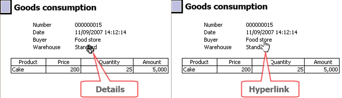
Fig. 384. Cursor Types in Spreadsheet Document
When a finished spreadsheet document is opened in the Read Only mode and the mouse is moved over a cell with the Details Parameter property filled, the mouse pointer can appear as shown on fig. 385. (Hyperlink type cursor is only displayed if the Hyperlink property is set for a hyperlink cell). It means that you may view the detail of a spreadsheet document. Now, if you double-click this cell (or make it active and press Enter or simply click it if it is a hyperlink), the field value is displayed:
String, Number, Date and Enum values are opened for viewing;
for Document values corresponding documents are opened for viewing and editing;
if a value is a catalog item, this item is opened for viewing and editing in a dialog box. If editing in the list is turned on in catalog properties, a catalog list form is opened and the spreadsheet field pointer is moved to the required catalog item.
This is standard detail processing that does not require any additional settings.
If you want special details processing, specify the name of the handler procedure for the cell for the Detail Processing event in the Events category of spreadsheet document properties. Describe drill down processing in the form module in this procedure using the 1C:Enterprise script.
Review the following example. A form and PrintTemplate template have been created for a report. The template includes Title, Header, GoodsHeader and Goods named areas. The Goods area contains a cell which has a details parameter named Detail The form contains the Table form element associated with the Spreadsheet form attribute of the SpreadsheetDocument type. The Detail Processing property in the Events category refers to the cell selection processing procedure named DetailProcessingResult() located in the report module.
The following procedure is used to generate a spreadsheet document:
Spreadsheet.ShowGrid = False;
Spreadsheet.ShowTitles = False;
Spreadsheet.Protection = True;
Spreadsheet.ReadOnly = True;

Template =  Documents.GoodsConsumption.GetTemplate("PrintTemplate");

// Header
Area = Template.GetArea("Title");
Spreadsheet.Output(Area);

// Header
Header = Template.GetArea("Header");
Header.Parameters.Fill(ThisObject);
Spreadsheet.Put(Header);

// Goods
Area = Template.GetArea("GoodsHeader");
Spreadsheet.Put(Area);
GoodsArea = Template.GetArea("Goods");

For Each CurRowGoods From Goods Do

GoodsArea.Parameters.Fill(CurRowGoods);
Spreadsheet.Put(GoodsArea);

EndDo;
Sample implementation of details selection processing procedure:
Procedure  DetailProcessingResult(Item, Details, StandardProcessing)
StandardProcessing = False;

DetailsType = TypeOf(Details);
If Detailstype = Type("CatalogRef.Nomenclature")
Then

ReportFormName = "ReportForm1";
Else

ReportFormName = "ReportForm2";
EndIf;

ReportForm = DataProcessorObject.GetForm(ReportFormName);
ReportForm.ExecuteReport(Details, PeriodFrom, PeriodTo);
ReportForm.Open();

EndProcedure
ReportForm1 and ReportForm2 are forms developed specifically for detailed reports (usually these forms contain a spreadsheet document field where the result is output).
Drill Down Use – specifies the drill down use area. If a cell is selected, drill down are shown for the current cell only; if a row is selected, drill down are shown for all cells in the current row. If DontUse is selected, no drill down are shown in any case: the pointer does not change its appearance (for possible cursor types see fig.
384) and cell selection is not processed. Values Property Category
Contains Value – if this option is turned on, a cell contains a value. This property influences the properties of other categories.
Value Type – type of cell value. For spreadsheet documents, this list contains Number, String, Date and Boolean types. For Spreadsheet document field form element, the list also contains types defined for the current configuration, including documents, catalogs, enumerations and others, in addition to primitive types. The Arbitrary data type may be added as well. This data type may be determined with 1C:Enterprise script tools during form filling.
Control – a control may be selected for editing cell contents. The list of possible values depends on the selected content type. For example, if Number data type is selected, Text box or Checkbox may be used as an editor. A row with the editor type Text box or Checkbox is added to the object list (Cells, Spreadsheet Document) for the specified editor type. Contents of the properties palette for this object depends on the type of selected control.
Format – format string to be used for displaying the value. If the display format is not configured, it is selected from the infobase regional settings.
Editing format – a format line that will be used for displaying the value is specified. If the image format is not configured, the format is selected from infobase regional settings.
Format can be entered manually or using the format string editor (see page 2-992).
NOTE
When a spreadsheet document is edited in a thin client, the following cell properties are not available: Contains Value, Value Type, Control, Editing format.
26.17.3. Spreadsheet Document in Data Input Mode
A report can also be created by entering information into cells of a spreadsheet document placed into a form element.
This information is processed with 1C:Enterprise procedures located in the form module. Calculation results may be used to calculate values for other cells of a spreadsheet document.
After entering the required information, you may print a report and save it for future work.
The overall procedure for working with a spreadsheet document in the data input mode looks like the following:
Spreadsheet document template is generated; it is prepared in a special way and used to input data.
A form that will contain a Spreadsheet document field field for data input is generated.
Spreadsheet document field form element handlers that will process userentered data (when necessary) are generated.
Let us review the steps listed above using generation of a goods delivery form based on the GoodsDelivery document. The target form is demonstrated on fig. 386. In this form, underlined fields are to be filled in by the user. Delivery date field value is automatically calculated by summing up Issue date and Delivery period values. Issue date is the document date.

Fig. 385. Delivery Form
26.17.3.1. Spreadsheet Document Preparation
Implementing a table box in the data input mode requires a Spreadsheet document template (named DeliveryForm). The generated template must then be opened and its Template property must be set to False.
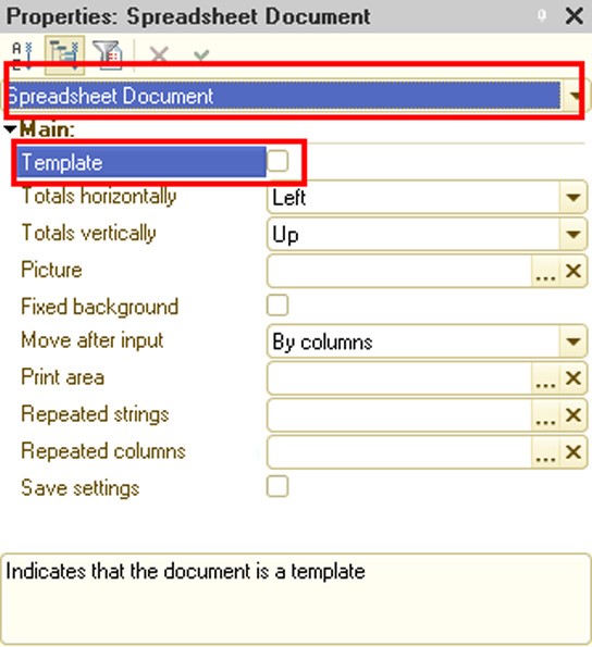
Fig. 386. Spreadsheet Document Properties
Then the required structure must be created for the document to be generated.
Create the required fields:
Delivery address. Merge several cells and define the following properties:
○ Name – ShipToAddress
○ Protection – False
○ Contains Value – True
○ Value Type – String
○ Control – Text box
Delivery period. Define the following properties for the cell:
○ Name – DeliveryTime
○ Protection – False
○ Contains Value – True
○ Value Type – Number, length: 3, precision: 0, non-negative ○ Control – Text box
Delivery date. Define the following properties for the cell:
○ Name – DeliveryDate
○ Protection – False
○ Contains Value – True
○ Value Type – Date, date content: Date
○ Control – Text box
Issue date. Define the following properties for the cell:
○ Name – IssueDate
○ Protection – True
○ Contains Value – True
○ Value Type – Date, date content: Date
○ Control – Text box
○ Format – DLF=DD
The resulting spreadsheet document should look as shown on fig. 387.
Fig. 387. Finished Template
The Show Named Cells mode is enabled for the template (to do this, select Table – Names – Show Named Cells in the menu).
NOTE
Properties that can be set for the text box in the template are neither saved nor used by the system to generate text boxes in spreadsheet documents in the data input mode.
26.17.3.2. Form Preparation for Data Input
After the spreadsheet document template has been finished, generate the form to be used for data input and implement a procedure to call it from the document.
Create ExecuteDelivery form command with the following code in the document:
&AtClient
Procedure  ExecuteDelivery(Command)
DeliveryParameters = New Structure("DocumentDate",  Object.Date);
OpenFormModal("Document.GoodsDelivery.Form.DeliveryExecution",  DeliveryParameters);

EndProcedure
The command should be placed in the form.
Now create the form to be used for data input.
To do this, create a custom DeliveryExecution form in the GoodsDelivery document and generate the following form elements:
DocumentDate form parameter of Date type
DocumentDate form attribute of Date type
SpreadsheetDocument form attribute of SpreadsheetDocument type
SpreadsheetDocument form element associated with SpreadsheetDocument form attribute

Fig. 388. Delivery Execution Form
After that implement the following handlers in the form:
&AtServer
Procedure  OnCreateAtServer(Cancel, StandardProcessing)

// Save document formatting date
DocumentDate = Parameters.DocumentDate;

// Set finished template
SpreadsheetDocument =  Documents.GoodsDelivery.GetTemplate("DeliveryForm");

// Set document creation date in the spreadsheet document field
SpreadsheetDocument.Area("IssueDate").Value =  DocumentDate;

EndProcedure

&AtClient
Procedure  OnOpen(Cancel)

// Activate spreadsheet document area
Items.SpreadsheetDocument.CurrentArea =  SpreadsheetDocument.Area("ShipToAddress");

EndProcedure
The resulting form filled with data looks like the following:

Fig. 389. Delivery Form
26.17.3.3. Implementation of Response to Spreadsheet Document Cell Change
The resulting form has no recalculation for Delivery period and Delivery date fields should they change.
To make recalculation possible, implement processing of the relevant event for the form attribute associated with the spreadsheet document.
Add the OnChangeAreaContent handler for the SpreadsheetDocument form element. The handler should contain the following code:
&AtClient
Procedure  SpreadsheetDocumentOnChangeAreaContent(Item, Area)

If Area.Name = "DeliveryDate" Then

SpreadsheetDocument.Area("DeliveryTime").Value =
(SpreadsheetDocument.Area("DeliveryDate").Value  -
StartOfDay(DocumentDate))  / (24 * 60 * 60);

ElseIf Area.Name = "DeliveryTime" Then

SpreadsheetDocument.Area("DeliveryDate").Value =
StartOfDay(DocumentDate)  +
SpreadsheetDocument.Area("DeliveryTime").Value  *
24  * 60 * 60;

EndIf

EndProcedure
Now the spreadsheet document is interactive.
26.18. FLOWCHART EDITOR
Flowchart is the schema of the sequence of actions for a business process. It is a part of the graphical schema.
The main difference between a flowchart and a graphical schema is the special processing of particular schema items (start and end points, actions, conditions, etc.).
The flowchart also plays the role of system instruction on the business process execution sequence and an illustration of the business process structure as well as a means to view the current state of a business process (see description of GetFlowchart() method in the 1C:Enterprise script help).
Flowchart is a rectangular screen area that usually contains different items, e.g., start point, end point, decorations, connecting lines, etc.
26.18.1. Flowchart Editing
To edit a flowchart in the business process edit window, click Route map on the Other tab.
You can edit a flowchart by placing various map items on the flowchart, editing properties of these items and connecting these items with lines.
You can use both the mouse and the keyboard to edit a flowchart. (Some operations can be performed only with the mouse, e.g., you cannot use a keyboard to connect flowchart items with lines.) When a flowchart is opened for editing, the Insert schema elements toolbar buttons and the Flowchart menu become available.
You can use the properties palette to configure a flowchart (see page 1-53).
26.18.2. Flowchart Items
26.18.2.1. Appearance Recommendations
The best way to draw a flowchart is to place the map in the vertical direction. A flowchart is vertically arranged (top-down). For example, when you add an Activity flowchart item (hereinafter referred to as an item), it is created with an outgoing downward-oriented connecting line.
Labels should use identical fonts. You can use various fonts as an additional means to attract attention (e.g., in a header of a decoration of a group of items).
You can use the flowchart editor to put various items into flowcharts, specify item size, level borders, etc.
The flowchart editor provides different features that simplify item placement. These features include a grid and different actions with item groups (leveling, distribution in a flowchart, size specification, etc.).
You can use individual item appearance as an additional feature. In properties under Appearance, the developer can select text and background colors, text font, border type and color, a picture to be displayed, tooltips, etc. Item properties vary depending on the type of item.
26.18.2.2. Items Order
Unlike regular graphical schemas, the flowchart preserves the type-specific order even if the order of certain items has changed. The following rules apply:
Decorations are always located in the background (below), i.e. you cannot change the order of decorations as related to other items as they are always located below.
Connecting lines are located above decorations.
All other items (business process visualization points) are located at the top. In this manner, when drawing the flowchart items, they are always placed above the decorations and decorative connecting lines by sort order.
26.18.2.3. Working with Connecting Lines
Flowcharts are used to show business process sequences by linking item with the Connecting line item. You cannot insert connecting lines arbitrarily as they are always attached to certain points in the business process and cannot exist per se. You cannot delete connecting lines unless allowed by the point in the business process (for example, Spliting Point and Switch).
You can link all business process visualization points, i.e. all items except Decoration, Connecting line and Decorative line items. By default most business process visualization points are inserted into route maps with one outgoing line that cannot be detached or deleted. However, you can move this line to a different port. A port is an area of an item where a line can be attached – usually it is a middle point of one of the sides of the rectangle containing the item. Available ports are marked with blue crosses on the map.
To work with the Connecting line item of a flowchart, you have to select it by clicking anywhere on the connecting line or by using the Tab (Shift + Tab) key to switch to it.
If the end of a line is not attached to any item, the rectangle at the end of the line is red and the arrow has an contour appearance, i.e., it is not painted inside. To connect the line to an item you have to drag the end of the line (a grey or red rectangle) to the port area of any item. The connecting line shall automatically rebuild upon dragging. You can also reconnect a connecting line by dragging its end to a different item. In this case the following restriction applies: you cannot create a direct cycle of items (point1 → point2 and point2 → point1) if neither of these flowchart items belongs to the Condition Point or Switch item types.
When you insert an item into the flowchart, free ports of these items are automatically connected to the closest available lines if it is possible. When you move or resize an item, the free ports of this item are automatically connected to the closest available lines and the outgoing lines of this item with free ends are automatically connected to a free port of other items in direct proximity if such a connection is possible.
Decorative line item is designed to connect decorations and flowchart points. You can place any number of decorative lines in a flowchart.
26.18.2.4. Flowchart Check for Correctness
When you run the Flowchart – Test command or save a flowchart, the flowchart is automatically checked for correctness. The following improper conditions are checked:
cycling;
unconnected lines;
route points (except for starting points) that have no incoming lines;
flowchart without starting points;
route points without a path to the end point;
flowcharts where some of the lines entering the join don't come out of the corresponding splitting point;
flowcharts where parallel branches (coming out of the splitting point) enter the same route points (before the join);
flowcharts with a cycle that do not contain any points of Activity, SubBusinessProcess Point or Data processor Point type;
flowcharts where any route point of Condition Point or Switch type has no event handler (ConditionCheck() or Switch(), respectively).
26.18.3. Flowchart Items
This chapter describes all types of flowchart items listed alphabetically.
Behavior of items is configured in the properties palette by setting and selecting values. Some item properties are common for all or most items. Individual properties of each item are detailed in the 1C:Enterprise script help.
26.18.3.1. Common Properties of Flowchart Items
There are many properties that are common for all or most item types. Usually these properties have a common purpose and are edited in a uniform manner. Below you will find a description of these properties. For more information on editing unique properties of some items, see the sections dedicated to individual item types.
Only properties that make flowchart items different from graphical schema items are described.
For descriptive convenience, the properties are grouped by category as they are in the properties palette.
Some properties that are described below can be unavailable for some items.
Main Property Category
Task Description – description of the task to be generated in Activities or SubBusinessProcess Points.
Events Property Category
Use this category of properties to configure the business process point behavior for specific actions, e.g., for interactive activation, task creation, condition check (for Condition Point items), etc.
When working with items, most actions can initiate the launch of procedures related to these actions. The body of each procedure contains a description of event handling in the 1C:Enterprise script.
To initialize the creation of a procedure responsible for event handling, click a special button on the properties palette located to the right of the attribute with event name in the Events property category (see fig. 390).
Fig. 390. Creation of Event Handler
The procedures are created in the business process module which contains the editable flowchart as a property.
When you work with a business process and a certain event occurs, program execution control is passed on to a procedure that is linked to this event.
For a list of flowchart events or items along with conditions that invoke them, see a description of the relevant object in the 1C:Enterprise script help.
26.18.3.2. Connecting Line
Connecting line items of the flowchart are used to connect business process visualization points (e.g. Start Point, Activity, Condition Point and other items). Connecting line items are automatically rearranged when you change the item position. You cannot modify the connecting line creation algorithm.
Connecting line is inserted automatically when you enter the other flowchart items; it cannot exist by itself. Only Spliting Point and Switch items allow you to insert additional connecting lines.
When the system creates a connecting line, it tries to create the shortest path consisting of vertical and horizontal line sections that does not cross other map points.
26.18.3.3. Activity
Activity items in a flowchart are used to display the main points of a business process that are used to assign and execute tasks. Addressing Property Category
Explanation – a line that contains additional characteristics of the activity. It is used when addressing attributes are inserted by the 1C:Enterprise script and not predetermined during flowchart design.
Group – if this option is set to True, all tasks for this business process point are issued to all group (department) members. Otherwise, one task is assigned to the entire group, e.g., Sales Department and only one person (the first who undertakes it) shall execute this task.
Addressing attributes – the number of these properties equals the number of addressing attributes for a task selected in the Task property of the current business process. You can use the properties palette to select one of the predefined values of the type specified in the addressing attribute of the task (e.g., from the Departments or Performers catalog).
26.18.3.4. Splitting Point
The Splitting Point item of a flowchart contains a business process point where the work flow splits into multiple parallel threads. By default this item has three outgoing connector lines.
Use the Add Outgoing Connector Line command from the context menu to add an outgoing line to this item. To delete an outgoing line you have to select this line and use the Delete command from the menu. You cannot delete the only remaining outgoing line.
26.18.3.5. Condition Point
Condition Point item is a business process point that has two possible exit points depending on the logical condition.
By default, Condition Point has two outgoing connecting lines from the left side and from the right side. The right line contains the process for the True value of the ConditionCheck() handler. You can swap the condition branches. To do this, drag a rectangle at the beginning of the line outgoing from Condition Point and move it to the opposite side of the Condition Point item.
26.18.3.6. End Point
End Point item contains the end point of a business process. A flowchart can have several items of this type.
26.18.3.7. Start Point
Start Point item contains a business process start point. If a business process has several Start Point items, you have to specify the required start point when you run the process. The Start Point item cannot contain connecting lines.
26.18.3.8. Join
Join item of a flowchart map contains a business process point where all parallel paths going out of the Spliting Point join. Until the task execution for all parallel paths arrives at the join point, no transfer to the point beyond the join point is executed. One splitting point always corresponds to one join point (although the opposite is not true; hence, there can be splitting points with no join points). You do not have to specify explicitly which Spliting Point item corresponds to the Join item. The system determines it automatically.
26.18.3.9. SubBusinessProcess Point
SubBusinessProcess Point item contains a business process point that executes a business subprocess. Execution of the main (parent) process resumes only after the subprocess is complete.
Data Property Category
Business process – a reference to a business subprocess.
26.18.3.10. Data processor Point
Data processor Point item contains a business process point that is executed in automated mode and has no destination.
26.18.3.11. Switch
Switch flowchart item contains a business process point with several exits (variants), one of which is selected on the basis of the Variant parameter value of the SwitchProcessing() handler.
26.18.4. Module
Flowcharts have no modules of their own. Event handlers are placed in the business process object module.
26.19. PICTURE EDITOR
The Designer offers users a special tool to edit pictures and picture collections.
Pictures are stored in the Common – Common pictures configuration branch as well as in the files on the local hard drive.
The Actions – Add command of the Common – Common pictures configuration branch creates a new picture which then can be opened for editing.
To edit a picture select it in the Common – Common pictures configuration branch and then use the Actions – Change menu command; in the dialog box that opens click the Edit button. If the picture format is different from PNG, the software prompts the user to convert the picture to PNG when it is opened. If the user cancels conversion, the picture cannot be edited.
WMF or EMF pictures cannot be edited.
To create a new picture located in a file on the local drive, select File – New and select Picture in the editor selection window. Edit the empty picture and save it by selecting File – Save or File – Save as…
To edit a picture stored in a file on the local hard drive, select File – Open and then select the necessary file from the list.
The editor has two modes of operation: picture editing and picture collection editing. The difference between picture and picture collections editing is purely conventional. A picture collection is a picture consisting of multiple picture items of the same size. Any picture can be saved as a picture collection. For example, a picture collection can be used to store and edit pictures with similar application, like icons, button pictures, etc. The picture-editing mode is a default mode of the editor.
Editing methods are independent of the selected picture type (see page 2-1013). For details on how picture collections work see page 2-1016.
26.19.1. Picture Editing
When you have selected (or created) a new picture, it can now be edited.
Fig. 391. Picture Editor
The editor window consists of a toolbar, two panels (the preview panel on the left hand side and the editing panel with the magnified picture on the right hand side) and a color palette where you can select colors.
The picture can be edited in both panels. Editing is done using the mouse. First you should select a painting tool or a shape (pencil, brush, airbrush, rectangle or ellipse) and a color using the color palette.
The status bar shows the current position of the mouse pointer as well as the scale of the image.
A picture is a rectangle consisting of a grid of dots (pixels) that you can resize by dragging the handle on the lower or right border or in the lower right corner. A picture can also be resized using the Picture Settings window (see below).
Editing consists of setting the color of each dot in the picture. The number of colors is defined by the picture resolution. The larger resolution is, the more colors can be used.
IMPORTANT!
Using 24-bit resolution for large pictures leads to an increase in the configuration size.
Color selection is made separately for each mouse button in the color palette. The selected color is outlined by a double frame.
Each color can be modified. To do so, double-click the color you want to modify. In the window that appears, select the color you need form color swatches or create a new one.
Picture size can be changed. Dragging a handle located on the sides or the corner of the picture area is just enough to achieve this task.
The grid (of pixels) is designed to simplify picture editing. The grid is formed with dotted lines. To setup grid display select Actions – Grid. The following dialog will open:
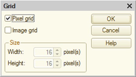
Fig. 392. Grid Settings
If the Pixel grid check box is checked, the pixel grid is displayed.
If the Image grid check box is checked, the program handles the picture as a picture collection consisting of pictures of the same size (picture collection editing is discussed in the next section). In this case collection item size selection fields become active. Besides the pixel grid, a collection grid is displayed in the picture editing field consisting of thin solid lines. However, the editing mode stays the same.
If the Image grid check box is checked, the picture resize step is equal to a cell size. If this check box is unchecked, the picture is resized by one pixel.
Various tools and the set of shapes are used for drawing. The set of tools and the way they are used is similar to the standard tools used in Paint, an integral part of Microsoft Windows. The shortcut table for the picture editor can be found in the Help menu.
However, there are some differences. By using the Scale button you can scale the image from 1:1 to 20:1 in a six step operation. By clicking the button you select the next scale step. If you reach the 20:1 scale, the next time you click this button the image is returned to the original scale, 1:1. The necessary scale can be selected at once by clicking the scale selection button with a small triangle pointed downward, located to the right of the scale button.
Clicking Scale and dragging the mouse pointer over any picture area causes the frame to appear. The latter indicates the picture area to be displayed when the user clicks the mouse.
You can also change the scale by holding down the Ctrl key and scrolling your mouse scroll.
Shape buttons (rectangle, rounded rectangle and ellipse) also have selection buttons and by using them you can select the shape type (common, outlined and filled or filled).
Clicking the Picture parameters button opens the following dialog box:
Fig. 393. Picture Settings
The picture size and resolution (the maximum number of colors) are set in this dialog. Alpha channel cannot be used for pictures with 1-, 4- or 8-bit resolution. Only one transparent color is allowed. Alpha channel can be used if resolution is higher than 8 bit.
NOTE
It is not recommended to use alpha channel for pictures that are bigger than 40000 pixels in size (e.g., 200õ200 pixels). The web client operating in Microsoft Internet Explorer 6.0 cannot render these pictures correctly. This rule does not apply to picture collections with items smaller than the size mentioned above.
The picture editor supports standard clipboard commands. Use Ctrl + V to paste a picture, Ctrl + C to copy it and Ctrl + X to cut (copy and delete). If the picture size is larger than the current dimensions, the editor suggests that you change the current dimensions.
The toolbar contains a button that changes its purpose depending on the selected tool or shape. It is located in the second row to the right next to the Picture parameters button. When the line or freehand tool, rectangle or ellipse shape is selected, this button indicates thickness of the line used to draw the shape in pixels. By clicking this button you can modify the thickness (five steps). By clicking the selection button you open the pop-up menu where you can select the thickness you need. This button sets the size of the airbrush, the size and shape of the brush and the size of the eraser. When a selection or text tool is active, this button allows you to set the transparency mode.
Click the Text button to enter text. The following dialog box is displayed:

Fig. 394. Text Entry Dialog Box
Enter the text in the multiline text field. The font family, size and other attributes are set using the Font button. The font family is selected from the list of system fonts or from the styles defined in the configuration.
By using the Replace Colors button you can easily change the font color selected by the mouse pointer on the color set for the given mouse key. In this fashion you can quickly change the drawing color using two colors per mouse key.
26.19.2. Picture Collections
A picture collection is a picture consisting of individual items (pictures) of the same size. These items form a rectangular matrix and each cell of this matrix contains an independent picture.
Picture collections are designed to simplify the selection of the necessary picture for controls, column title bars and so on. By using the collection you enable selecting pictures of the same size for identical application.
The picture editor enables you to create and edit picture collections. Select Collection Mode to go to the collection editing mode. By selecting this item you break the picture in the preview field into cells. To edit a picture item in the editing field simply double-click it. The drawing techniques are discussed in the previous section.
Two buttons (Add Column and Add Row) are added to the toolbar. By clicking these buttons you can add a new column or a row respectively to the picture.
Item size can be modified in the Picture Settings dialog box only (scale handles are not available).
Fig. 395. Collection Parameters
In the Picture Settings item group, the cell (picture) parameters are set. In the Collection Options item group, cell size in pixels (dots) are set.
A picture collection can also be edited as a common picture. If you do this, it is recommended that you setup the image grid first (see page 2-1013).
26.20. HTML DOCUMENT EDITOR
This editor offers the user all the major features for editing HTML documents. It can also be used to edit help content for configuration objects.
Fig. 396. HTML Document Editor
The editor has three tabs:
Edit – use this tab to edit documents in visual mode.
Text – use this tab to edit documents with the help of HTML markup language. In this case editor functionality matches that of the text editor (see page 2-943).
Preview – this tab can be used to preview the created document; however, editing is unavailable.
26.20.1. Visual Editing
26.20.1.1. Formatting Text
You can format HTML document text, e.g., set up its style (font, size, decoration, indents, alignment, etc.).
When you copy text from other text editors, for example Microsoft Word, the original text formatting is retained.
26.20.1.2. Inserting and Editing Tables
You can add tables to HTML documents. To do this, select the Table – Insert Table command. A dialog box will open. Type a number of rows and columns in the dialog box.
If you find out later in the course of editing that the specified number of rows or columns is not sufficient, more can be added.
To edit a table (insert and/or delete rows, columns and cells), use the commands from the Table menu of the Designer main menu.
|
"Table" menu option |
Action |
|
Insert Row |
Add a new row above the current one |
|
Delete Row |
Delete the current row |
|
Insert Column |
Add a new column on the right |
|
Delete Column |
Delete the current column |
|
Insert Cell |
Add a new cell on the left. All the cells on the right are shifted |
|
Delete Cell |
Delete the current cell. All the cells on the right are shifted to the left |
|
Merge Cells |
Merge two cells (the current cell and the one on the right). The information entered into these cells is also merged. If more than two cells need to be merged, repeat this operation several times |
|
Split Cell |
Split the current cell into two cells |
Tables can be nested. To add a nested table create a new table in a cell of the existing table.
26.20.1.3. Picture Insertion
You can insert pictures into your HTML document.
To insert a picture select the Element – Picture command. A dialog box will open. Type in the path to the picture file (a path and a file name) or select a file in a standard file selection dialog box. In the Text field, enter tooltip text which will show up as a floating popup in the view mode when the user hovers a mouse pointer over the picture.
If necessary, specify picture alignment (position in the document) in the Layout attribute group.
|
Alignment Option |
Actions |
|
Not assigned |
Picture is in the text |
|
Left |
Picture is in a new row closer to the left border of the document |
|
Right |
Picture is in a new row closer to the right border of the document |
|
Above the Text |
Picture is in a text aligned towards the center of the picture |
|
Bottom |
Picture is in a text aligned towards the bottom of the picture |
|
Middle |
Picture is in a text aligned towards the center of the picture |
|
Top |
Picture is in a text aligned towards the top of the picture |
If the picture has to be placed in a border, enter border width in the Border width dialog box attribute. If the width is not defined or equals 0, then the border is not displayed. Click OK to insert the picture. Attributes specified in the dialog box can be changed using the picture properties palette.
Inserted pictures can be moved. To do this, point to the picture and drag it to the correct place in the document. The Position picture property does not change in this case; for example, if neither Left nor Right is set up, the picture can be added to the text, otherwise the picture is placed in a new row.
Pictures can be copied. Copy operations are standard (through the clipboard or using the mouse with the Ctrl key held down).
Pictures can be placed anywhere in HTML documents (text, table or label).
26.20.1.4. Marquee
Marquee is a special object of HTML documents. It is an area where text, a table, a picture or other labels can be placed. When a label is displayed, nested objects scroll continuously from right to left.
To insert a label select the Element – Marquee command.
Labels can be resized. To do this, select a label and move its marker with the mouse.
Labels can be placed in a text and a table.
26.20.1.5. Hyperlink
HTML documents support creation of links for hypertexts.
Select a text or a picture object and go to Element – Link. The link creation dialog box appears on the screen (see fig. 397). Specify the following in the URL attribute:
hyperlink path;
reference to help information about the configuration object;
reference to the system help section. If Managed application is selected as the configuration editing mode, only help sections associated with managed applications are displayed (along with the column that describes availability of these sections in the web client). If Managed application and ordinary application is selected as the configuration editing mode, all help sections are displayed with information about their availability in managed applications, web clients and ordinary applications;
tab name (preceded by the "#" character).
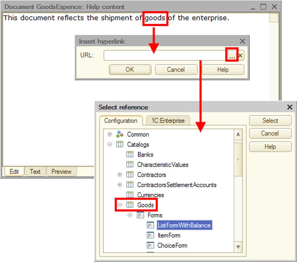
Fig. 397. Insertion of Hyperlink
To create the link click OK.
The selected object can be formatted in compliance with the style of the hyperlink. It is usually blue underlined text. Picture is placed inside a blue border.
26.20.1.6. Bookmark
You can create bookmarks for internal references within the current HTML document. To do this, select a text or picture object and go to Elements – Bookmark. Dialog box for bookmark name entry appears on the screen. The selected object is not formatted now.
Bookmarks are used to organize internal links.
26.20.1.7. Line
Lines can help organize a document visually.
26.20.2. Editing in HTML Format
Features of the HTML document editor listed on the Edit tab are limited. In the Text tab, the developer can edit the document directly in the HTML code.
Please remember that manual encoding changes using the charset attribute of the META tag do not affect editor behavior. When you save an HTML document, it is encoded using UTF-8 with the unchanged charset tag, which is set to UTF-8 when the document is read.
26.20.3. Viewing Results
To view the final HTML document switch to the Preview tab and check the layout and behavior of document objects.
26.21. LOCALIZATION OF CONFIGURATIONS
Localization of configurations means translating the 1C:Enterprise system strings to languages specified in the Common – Languages branch of the configuration tree. Strings can include names of interface objects, names (synonyms) of objects, help content, module texts, etc.
The most difficult part of this work is finding the places where the text is to be entered in the required language. Therefore, it is convenient to use this mode even when only one language is selected.
To start searching use the Edit – Edit interface texts command.
The following dialog box is displayed:
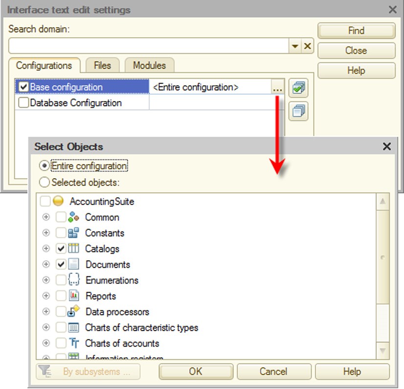
Fig. 398. Edit Interface Text
On the Configurations tab, you can select configuration objects for editing interface texts.
The configuration list includes all open configuration windows (in addition to the main configuration, these can include database configuration, configuration files, repository configuration and vendor configuration).
You can select Entire configuration to create a full list of configuration objects containing interface properties. You can perform search only for specific objects if you select this object in the combo box.
Use the Files tab to select text and spreadsheet documents as well as external data processor stored in files.

Fig. 399. Set Up Search in Files
Check the Search in NStr functions in modules option on the Modules tab if you need to determine where the NStr() operator is used in modules.
To remember the search parameters (the list of configuration objects, files and open documents), specify a name for the current settings in the Search domain attribute. When you reopen the search window, you just have to select the area you need from the list and perform your search.
Select the objects you need and click Find. The following window is displayed:
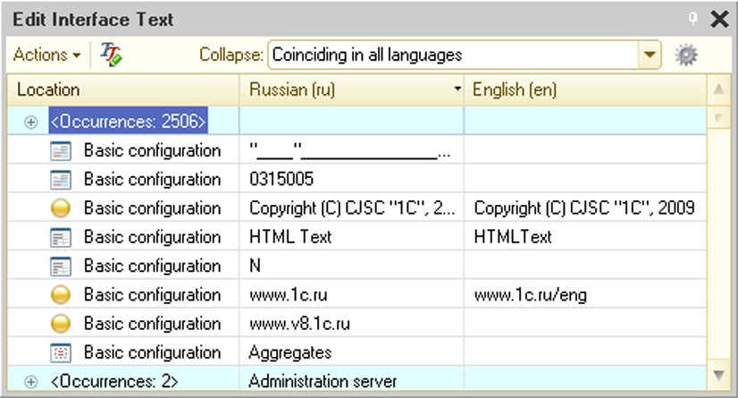
Fig. 400. Search Results Window
The window contains a table box. The first column of this box shows the location of the found text. Other columns are usually used for other languages. The table box can have more columns than the number of languages specified. Additional columns appear when new Language objects are created in the configuration process and then they are deleted or their language code is changed (when the language code is deleted or changed, the Designer does not reset the interface text for these languages).
Table box content is sorted by the contents of one of the columns. Click a column header to change the sort order. Clicking the header again changes the sort direction.
Text can be edited directly in cells. To do so, select a cell and press Enter. Text box opens in the edit mode. Enter the text you want and press Enter again. The modified text is shown in red.
For quick access to the interface text for a specific object, double-click the required line in the Arrange column. A form with this text is displayed. You can also view and replace the found text in the properties palette. If text has been modified outside the editing window, you can refresh the table box.
Above the table box, there are controls for performing various actions and window setup.
Use the Collapse combo box to specify the text collapse mode for different languages. If this option is set to None, the text is not collapsed. If this option is set to Matching in sort language, all items with the same text in a sorting column are collapsed. The first column contains the group mark (+) which can be used to expand the group. The first column also contains the <Prefixes: N> text (where N is the number of item occurrences). If other columns of this group have different text values, cells in these columns contain <Different values> text.
If this option is set to Matching in all languages, all items with the same text are collapsed.
You can perform mass replacement for text in collapsed rows. To do so, enter this text into a cell for the appropriate language as if it were one string. This text will replace the text in all rows of a group.
Use Actions – New search to open the setup window for configuration sections to be searched.
Use Actions – Copy texts to copy all texts in one language to a different language. It is recommended to use this operation only when words and phrases in different languages are similar to each other.
Actions – Clear texts clears all texts in the selected language.
Use Actions – Fill texts to translate synonyms, headers, tooltips and interface texts quickly using a matching file. This represents a spreadsheet document with several columns (according to the number of languages used).
The first row of each column contains a language code (for example, en or de). Other rows contain matching samples. There are no requirements to sorting (ordering) rows. Rows can be duplicated.
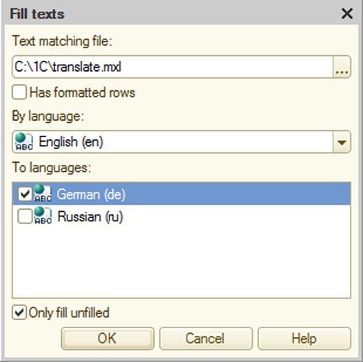
Fig. 401. Filling Texts
After selecting the matching file specify the default language (By language) and the languages of the translation (To languages). Setting the Only fill unfilled check box locks rewriting already localized rows.
Select the key language and languages for filling from the languages discovered during the interface text search. All languages selected for filling must be specified in the matching file (it must contain columns with headings corresponding to the codes of these languages).
NOTE
If you see rows in only one language when you open the Edit interface texts window, the Fill texts command becomes unavailable.
Fill interface texts by pressing OK. Texts are filled not only performing a check for matching to the language used as a basis for the loading, but for matching to all languages available in the text matching file.
This allows you to insert different rows in one language as a match to identical rows in another language. You can create a secondary language in the bilingual configuration to comment on the interface texts and provide different comments to homonyms in the default language. For example, two Account strings can have different comments: financial term and user account. Then, when the interface texts are filled from a file, you can match them with different words.
Use the Actions – Export to spreadsheet command to move the contents of a table box to a spreadsheet document. When you execute this command, only unique rows are displayed.
Use the Actions – Settings command to set up a table box view and editor opening mode for mass replacement.
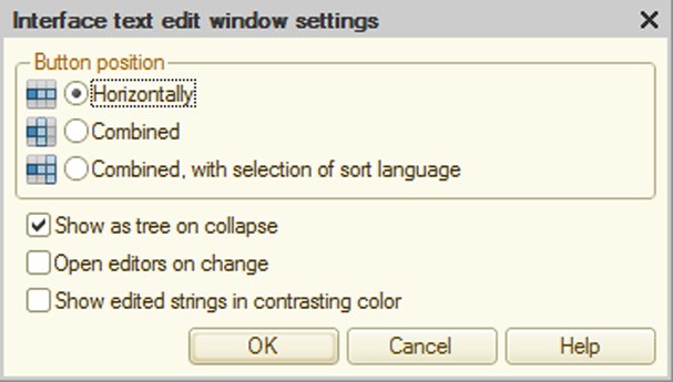
Fig. 402. Interface Text Editing Window Options
The Button position group is used to select a mode for column placement:
Horizontally – as shown on fig. 401.
Combined – columns are placed one below the other.
Combined, with selection of sort language – this option places columns as follows: to the right of the Arrange column you will see the column with the current language of sorting and further to the right there will be columns with other languages. When you click the header of a column, the list is sorted by this column and it is moved to the left of the Arrange column. A column for sorting replaces the selected column. If there are only two languages, the columns will simply change places.
If the Show as tree on collapse option is checked, you can access collapsed rows and collapsed groups are shown as a tree.
It is recommended not to check the Open editors on change option if there are many entries.
If the Show edited strings in contrasting color option is checked, the text in modified rows is shown in another color.
26.22. CENTRALIZED CONFIGURATION CHECK
To perform the configuration check select Configuration – Check configuration. The following window is displayed (see fig. 403).
Let's review how configuration is validated in more detail. Any application code in 1C:Enterprise is executed in an environment. This environment is characterized by a certain set of defined preprocessor instructions (see page 1-159) and a set of available objects. Respectively, when the configuration is checked, the Designer defines preprocessor instructions for every checked item and performs a validation. Note that if a client application is checked in the client/server version, all application code is checked on the client side, and only common modules available from the client application are checked on the server side.
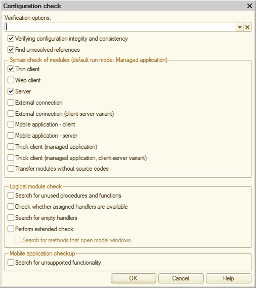
Fig. 403. Check Configuration
Since there are quite a lot of operating modes, validations are divided into two groups:
A group of validations available for forced and automatic check when the configuration is edited. These modes are available for selection in the Modules – Check settings configuration dialog of the Designer (see page 1-159).
The whole list of validations that can be called for a central configuration check (described mode).
Further, we describe which preprocessor instructions will be defined for every validation mode, mode specifics (if any) and validation modes that are not related to determination of the environment of the executed source code.
General Options
Verifying configuration integrity and consistency
It is a standard check (typically performed before updating the database). This check deletes incorrect data that could have been added to the configuration after the previous versions of the system were edited.
Find unresolved references
It searches for references to deleted objects. It is performed for the entire configuration, including forms, templates, interfaces, etc. Logically incorrect references are also detected.
Module syntax check
Thin Client
It checks the module compilation while checking the thin client environment in the managed application mode (executed in the file mode).
Web Client
It checks the module compilation while checking the web client environment in the managed application mode (executed in the file mode).
Server
It checks the module compilation in the 1C:Enterprise server environment check mode. The following preprocessor instructions are defined: Server.
External connection
It checks the module compilation in the external connection environment check mode (executed in the file mode version). The following preprocessor instructions are defined: ExternalConnection.
External connection (client/server mode)
It checks the module compilation in the external connection environment check mode (executed in the client/server mode).
Mobile application - client
Module compilation is checked in the environment check mode for the client application running on the mobile platform.
The following preprocessor instructions are defined: Client, AtClient, MobileAppClient.
Mobile application - server
Module compilation is checked in the environment check mode for the client application running on the mobile platform.
The following preprocessor instructions are defined: Server, AtServer, MobileAppServer.
Thick client (managed application)
It checks the module compilation in the managed client environment check mode (executed in the file mode).
If the Use ordinary forms in managed application configuration property is set to False ordinary form modules are not checked when this test is selected. The following preprocessor instructions are defined: Client, ThickClientMa- nagedApplication, Server.
Thick client (managed application, client/server mode)
It checks the module compilation in the managed client environment check mode (executed in the client/server mode).
If the Use ordinary forms in managed application configuration property is set to False ordinary form modules are not checked when this test is selected. The following preprocessor instructions are defined: Client, ThickClientMa- nagedApplication.
Modules shipped without source texts
If the configuration distribution settings for some modules specify transfer without source texts, it checks whether module images can be generated.
Logical module check
Search for unused procedures and functions
It searches for local (non-exported) procedures and functions with no references. Unused event handlers are also detected.
Form module procedure or function is considered used if its name can be found in "ProcedureName" (including double quotes), i.e. if it is a parameter for a method, e.g., assignment of handler for an event.
Check assigned handlers availability
It checks availability of event handlers for interface, form, control and flowchart items.
Search for empty handlers
It searches for assigned event handlers that perform no actions. If available, such handlers can reduce the system performance.
Extended check
For a restricted set of types, calls of object methods and properties are checked "over the period". Parameters set by the string are also checked for correctness for a restricted set of methods.
Search for methods that open modal windows
This checkbox is only available if extended configuration check is enabled. In this mode Designer looks for methods to open modal dialog windows in modules. The Modality usage mode configuration property does not affect the check mechanism. If you select this checkbox, errors are generated even if the Modality usage mode property is set to Use or Use with warnings.
Mobile application checkup
Search for unsupported functionality
In this mode, check reveals the following:
Configuration objects that are not implemented for the mobile platform in the applied solution;
Exchange plans with their Distributed Infobase property selected in the applied solution;
Configuration objects that are not supported by the mobile platform:
○ In Type properties of object configuration attributes, constants, session parameters;
○ In the Command parameter type property of the Command object; ○ In the Type property of attributes and form attribute columns.
Non-managed forms;
Form items that are not supported by the mobile platform. This check is only performed for forms that are intended for use on mobile devices (this is specified in the Use purposes form property).
Multiple forms on the start page.
You can save the specified settings for further use. To save the settings, specify their name in the Verification options field. To use previously saved settings, select their name in this field.
All error messages are displayed in the message window.
To interrupt configuration check use Ctrl + Break shortcut.
NOTE
In the initial check stage interruption can be processed with delay.
When configuration connected to the repository is checked, it is recommended to lock the configuration root object in order to avoid errors related to metadata information.
If the Edit configuration for startup modes parameter (see page 2-1148) is set to Managed application and ordinary application, the following parameters are added to the dialog box:
Thick client (ordinary application)
Thick client (ordinary application, client-server variant)
In this case the dialog box looks like the following:
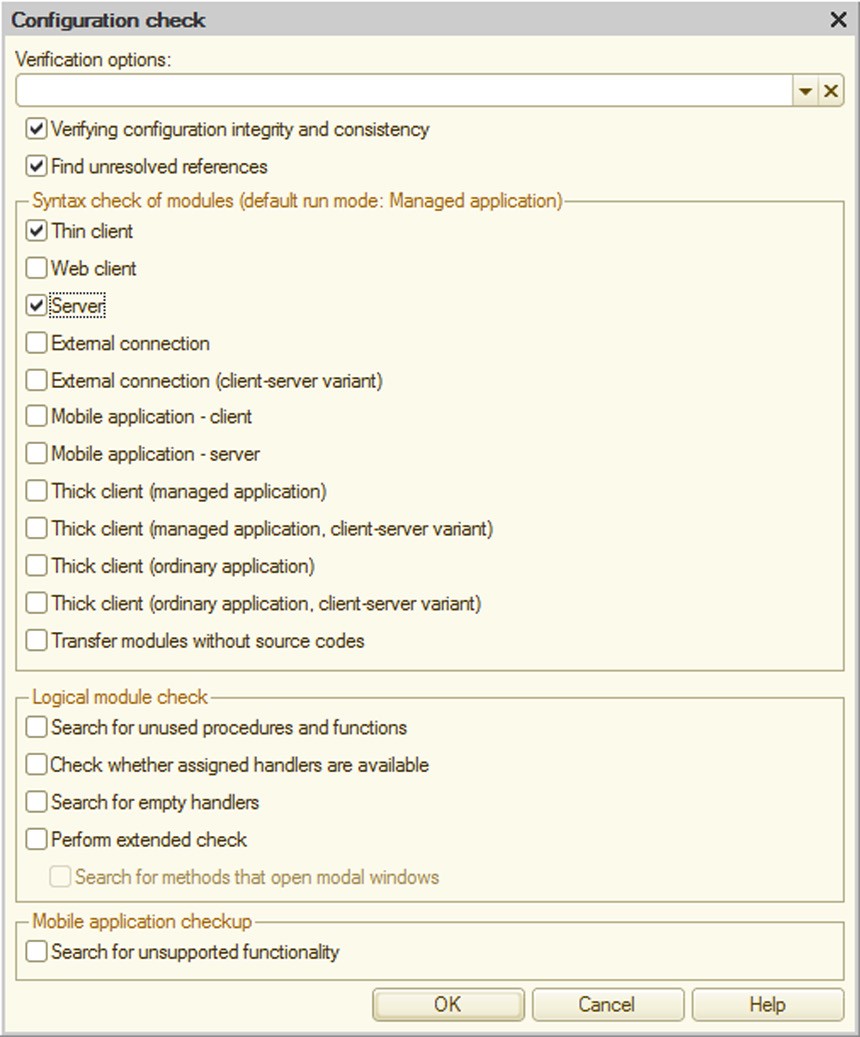
Fig. 404. Check Configuration
Below is description of these tests.
Thick Client (Ordinary Application)
It checks the module compilation in the client application environment check mode (executed in the file mode).
If the Use managed forms in ordinary application configuration property is set to False, managed form and command modules are not checked when this test is selected. The form module specified in the Default Constants Form property is tested at the time this test is selected regardless of the Use managed forms in ordinary application property value.
The following preprocessor instructions are defined: Client, ThickClientMa- nagedApplication.
Thick Client (Ordinary Application, Client/Server)
It checks the module compilation in the client application environment check mode (executed in the client/server mode).
If the Use managed forms in ordinary application configuration property is set to False, managed form and command modules are not checked when this test is selected. The form module specified in the Default Constants Form property is tested at the time this test is selected regardless of the Use managed forms in ordinary application property value.
The following preprocessor instructions are defined: Client, ThickClientMa- nagedApplication, Server.
26.23. USABILITY ANALYSIS FOR OPERATION OF SOLUTIONS BASED ON 1C:ENTERPRISE PLATFORM
Launching a client application with the /logui command line key creates logui.txt file in the application file folder %APPDATA%\1C\1Cv82\<Unique IB Identifier> on the user machine. This file registers all interactive user actions (pressing keys or clicking the mouse).
Example:
"19.06.2008  16:22:49","Event FormActivate","Name
Document.GoodsReceipt.Form.ListForm","t=0"
"19.06.2008  16:22:49","Event FormActivate","Name
Document.GoodsReceipt.Form.ListForm","t=0"
"19.06.2008  16:22:49","Event LClick","Form
AccumulationRegister.Settlements.Form.CurrentSettlements",
"Type TableBox","t=0","beg"
Interactive actions are recorded for thick and thin clients and are not recorded for web clients.
For details on logui.txt file format see "1C:Enterprise 8.3. Administrator Guide".