
1C:Enterprise 8.3. User Manual. Taxi Interface. Contents
CHAPTER 2. OPERATION IN FORMS
In 1C:Enterprise a user operates forms. A form may contain various items that are used to display information and for users to edit this information. These items can include text boxes, command bars, buttons, check boxes, bookmarks, tables, various charts, fields of text, spreadsheet and HTML documents, fields of geographical and graphical schemas. This chapter covers general techniques used to work with forms and form elements.
2.1. GENERAL TECHNIQUES OF WORKING WITH FORMS
There are several items which every form has. Normally a form title includes the name of the object or the list of objects displayed in the form. A title for a form is specified during configuration development and cannot be customized by a user.
To select an object, hover your mouse over the object and left-click it. Alternatively, use the cursor control keys if you use your keyboard.
To switch to editing an object, double-click it or press Enter.
Form elements may contain tooltips describing the meaning of such items (defined during configuration development). In order to see a tooltip for a specific form attribute, hover your mouse cursor over this attribute. In 1 to 2 seconds, a label will appear near the cursor that describes the purpose of the attribute (provided that the label was created upon setup of the form).
Navigation through form elements. You can navigate through form elements by pressing Tab or Shift + Tab or by clicking the necessary dialog control.
Some elements (for example, the command bar) can be unavailable for navigation with Tab or Shift + Tab based on their settings. You should use your mouse or press Alt + F10 to navigate to such items.
You can also press Enter when you complete entering an attribute. This will move the cursor directly to the next dialog item. The sequence of such movements is defined during configuration development.
If provided for in the configuration, a form may also verify whether the entered data is correct and complete. Error messages may be displayed in case of incorrect input.
Besides, when you complete entering an attribute, the system may also automatically carry out some actions (for example, filling values of other form attributes).
Saving form parameters. If a form can be resized, the form’s size and its location on the screen will be remembered when the form is closed and reopened. At the same time the controls will also preserve the sizes they had when the form was closed.
Appearance of a form is defined in the configuration and can be customized if customization for the form is supported (More – Change form menu item). The procedure used to customize forms is described in the "Form Setup" section on the page 142.
2.2. THE FORM CONTROLS
A form in 1C:Enterprise 8 may contain different controls for displaying information, entering data, and communicating with the user: a number of fields, flags, buttons, tables, etc.
2.2.1. The Text Box
A text box can be used to view, enter, and edit different types. To enter a value in the box, hover the mouse cursor over the box, then click and enter the value using the keyboard or by selecting it from a list.
Performing actions using a text box depends both on the type of data edited or viewed in the form control and on the selected configuration settings.
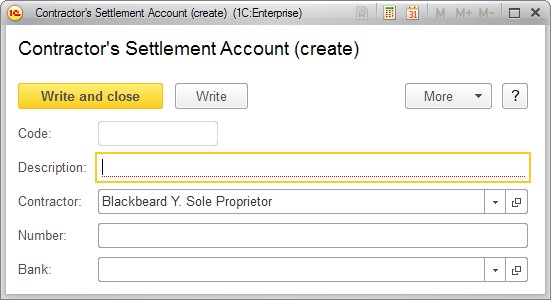
Fig. 23. Sample form with text boxes
Under normal circumstances, to enter data in the box, navigate to the required text box by left-clicking or pressing Tab. OS supports editing character strings, i.e. using a clipboard.
When a field is highlighted in red, this means that the field should be filled in.
A pale border around the box means that the field is either automatically filled in or should not be filled in (for instance, the Code field at fig. 23 is automatically filled when data is written). When an attempt is made to change a value in such a field manually, the system displays a warning.
Should incorrect data be entered, a drop-down list displays a warning that no such value has been found.
Press F4 to open a list of selectable elements (see fig. 24) or a pop-up list (if supported by the program).
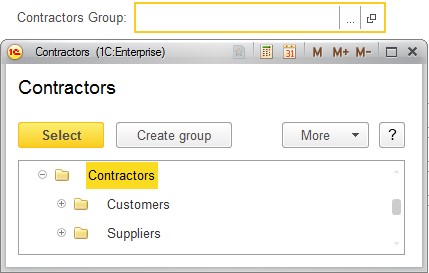
Fig. 24. Selecting a group of contractors from the list
Click Ctrl + Shift + F4 to open a form for the selected element.
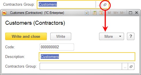
Fig. 25. Opening a selected element form from a text box
A pale border around the text box (as around Code at fig. 25) means that a value in this box should not be edited.
If a multiline mode is set for the text box, pressing Enter does not take the user to the next element of the form, and instead a new line is started in this text box.
An extended input mode may be set for a multiline text box: this enables a tabulation character and standard text search to be used. It should be noted that this mode does not support navigating to the following element of the form using Tab.
If a text box has a limited data size, a part of the source text required to fill the remaining space (or the highlighted text) will be taken, when data is inserted into the text field from the clipboard.
2.2.1.1. String
If a text box is related to string data, it will look as follows:

Fig. 26. A sample String type text box
A text box that is related to string data and is empty may display an input tooltip, depending on the configuration. The tooltip is displayed in an empty text box, is hidden when text is typed and does not impact the value entered.

Fig. 27. A text box tooltip
2.2.1.2. Number
If a text box is related to numerical data (i.e., a number, a sum), the selection button will look like a calculator. The user can press the button and edit the numerical value using the displayed calculator.

Fig. 28. Entering numbers into a text box using a calculator
You can use arrow buttons to edit numeric values (if this option is available).
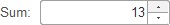
Fig. 29. Editing a number using arrow keys
2.2.1.3. Date
If a text box is present for the purpose of entering dates, an empty date field may display periods and colons as separators, depending on program settings.
An embedded calendar may be used to enter the date.
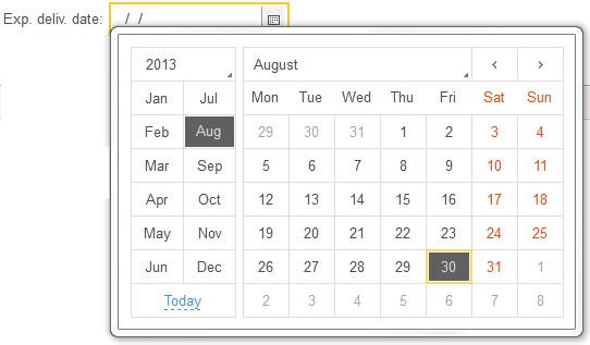
Fig. 30. Entering dates in a text box using a calendar
If a text box contains date and time information, but displays only the date or displays the date and only part of the time, that part of the time that is not displayed remains the same when the date is edited in the text box.
2.2.1.4. Different Data Types
In addition to the attribute value types described above, the form supports entering the following types of values. A text box for such an attribute contains a Select button. When this button is pressed, a list of types that can be selected will be displayed.
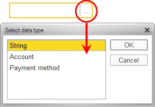
Fig. 31. Entering the required type of data
Select the name of the required type in this window. Then select the required value in the list that subsequently opens.
2.2.1.5. Selecting the Value of an Object
There is no need to open a separate window to select an object value: use the list that pops up when the cursor is hovered over the text box or press the selection button in the box (or the Down Arrow key, except in multiline fields).
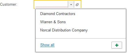
Fig. 32. Text box with a pop-up list
TIP
F4 on the keyboard may also be used to select an element, while Ctrl + Shift + F4 opens the selected element’s form.
Select the required line from the list by left clicking it.
The pop-up list may also contain and display a history of the selected values. When the cursor is placed in the text box, the pop-up list displays the last selected data values, simplifying the selection of data used earlier.
Searching for a value in the text box. When the cursor is placed in the text box, a prompt to enter a search term, display a full list of data (Show all or F4), and/or create a new object (Create or F8) may appear.
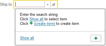
Fig. 33. A pop-up list in the text box
If an entered value is not included in the list, the program asks the user whether all values should be displayed or a new object created.

Fig. 34. No values are found in the list
When a user starts typing, the program finds data that correspond to the text entered and outputs it as a drop-down list. Depending on the program settings, a user can search for values from the beginning of the line or in any part of the line. For example:
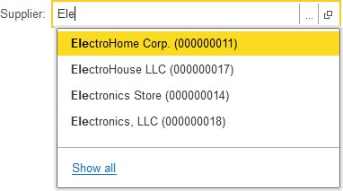
Fig. 35. Searching from the beginning of the line in a text box
If it is possible to search using any part of the data in the field, any text fragment may be entered, as shown in the figure below:
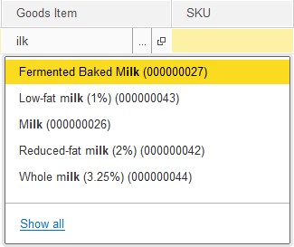
Fig. 36. Searching using any part of the line in a text box
If there is a great deal of data and processing this data will take a long time, the following message will appear during the search process.

Fig. 37. Background data search
If the data marked for deletion is selected in the field, a warning message appears.
If no corresponding values are found for the text which has been entered, the system prompts the user to select one of the following actions: select from list, show all, or create a new object (if this is supported in the program).
If Create is selected (or F8 is pressed), a Create new object form is displayed.
When a text box is selected in the drop-down list and the user clicks another element of the form using the mouse, the drop-down list will close, while the value set in this list will not change.
NOTE
The program will not allow the user to enter any text for attributes of an undefined type (for instance, if a composite type is selected) until the correct data type is specified.
Full-text search of data at input Depending on the configuration settings, a full-text search may be used to search the data in a text box. One or more words may be entered. The system will search the data using any of the words entered.
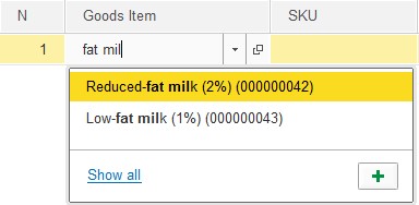
Fig. 38. Full-text search in a text box
A full-text search finds strings containing the required words in all forms and arrangements. Both full words and strings, where the strings that are entered form only a part of a whole word, will be found. (Similar to a * statement for a full-text search).
The selected value is rejected. To clear the value that was entered when selecting from a list, click the clear button to the right of the attribute’s field (if the clear button is supported in the configuration), or press Shift + F4. This will set the field back to the default value.

Fig. 39. Text box with a clear button
To cancel an input value and return to the previous value, press Esc.
In a multiline text box the user will be prompted to save changes when Esc is pressed. To save the changes, click Yes. To cancel the changes, click No. To return to editing the field, click Cancel.
2.2.2. Check box
A Check box control is intended to enable or disable a certain value.
Check boxes with two or three states may be used.

Fig. 40. Sample check box in a form
If a checkbox in a table column or a form is disabled, it is displayed differently.
To toggle the value of a check box, click it or if you use your keyboard you should first activate it using Tab or Shift + Tab and press the Spacebar.
If a check box has two states, you can also use the + (plus) and - (minus) keys to toggle it.
2.2.3. Radio Button
The Radio button form control is intended to select one of multiple possible values. The required value is selected using your mouse. If you use your keyboard, you should first activate the currently selected value of the radio button using Tab or Shift + Tab, select the required value using the arrow keys and press Enter. For example, a form of a good provides for selection of the type of goods:

Fig. 41. Type of goods radio button
2.3. TUMBLER
The tumbler is intended to select values (as the radio button) and to enable value (as a check box). For example, see fig. 42:

Fig. 42. Order status tumbler
To select a value, press the corresponding button of the tumbler. A green indicatior is activated for selected button and it looks brighter.
2.4. PROGRESS BAR
The progress bar only designates the current state of associated form attribute (it is specified during designing of the configuration).

Fig. 43. Progress bar
2.5. SLIDER
You can use the Slider for quick and vivid input of numeric values. Its appearance is similar to an ordinary scroll bar placed vertically or horizontally on a picture under the associated text box.
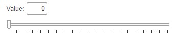
Fig. 44. Value adjustment slider
The value of the associated attribute is determined by the slider's position and by the minimum and maximum values specified during designing of the configuration.
You can move the slider using the arrow keys but it is more convenient to use the mouse.
2.6. HYPERLINK
A form may contain controls that are formatted as text but when you hover the mouse cursor over this text, the cursor will change to a hand (see fig. 45) and the text will be underlined. This control is named a Hyperlink. The control is intended to switch to a specific object (e.g. to open other forms). To select a hyperlink, click it or activate it using Tab or Shift + Tab and press Enter. Designing of a configuration defines hyperlinks behavior when they are clicked on. Pictures located in forms can also have hyperlinks. When you mouse-over a hyperlinked picture, the cursor will change to the one shown in fig. 45.

Fig. 45. Hyperlink in a form
2.7. BUTTON
Buttons in a form are used to perform some actions specified by the form algorithm. To select a button, click it or activate it using Tab or Shift + Tab and press Enter.
One of the buttons in a form can be predefined, and you can press it not only by clicking but also by pressing Ctrl + Enter.
For some buttons, other keyboard shortcuts may be provided that enable the user to select them without using the mouse and without reaching it by tabbing through the form controls.
For some buttons a pressing display mode can be specified. These buttons are used to enable or disable some mode.
2.8. TABLE
A form may contain a table that is intended to view a list containing multiple columns. The assortment of columns depends on the purpose of the specific form. The rows contain the data that you can view and edit in some cases. An example is a nomenclature list in the Sale document.
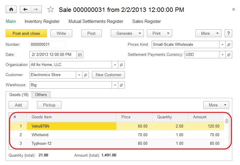
Fig. 46. List of goods in the sales document
In some forms, columns are located so that their values in each table row are displayed on two or more levels. This allows to display more information in a row simultaneously without horizontal scrolling of the table.
Adding, copying, deleting, editing, sorting, filtering and other actions on data contained in a list are generally performed using the list command bar buttons or using commands of the context menu opened in the list area (if such actions are provided for during configuration development).
Methods of working with a table depend on the type of data being edited or displayed in the form control as well as on the settings specified in the configuration or determined by the 1C:Enterprise script. These methods generally match those rules used to work with an text box. To begin editing a cell, press Enter or highlight the cell and begin editing. To complete editing a row of a table, press Shift + F2.
Viewing a table. You can use your mouse and keyboard to view a table.
For convenience of viewing a table’s content, you can resize the width of columns. To do so, hover the cursor over the column border so that its form changes and left-click the border. Select the required column width by moving the mouse, and then release the mouse button. The selected column sizes are saved. Holding the Ctrl key while resizing the column width prevents the adjacent columns from been affected. Use this method if there are no titles for some system lists.
If the column width prevents you from seeing the entire field content, you can view it using the following actions. Place the cursor over the required column in the row you need and the entire content of the field will be displayed near the cursor.
You can change the column order when viewing the table. If you need to specify an order for the columns, use form customization procedure described on the page 142.
In some tables you can select multiple rows of a list. Holding Ctrl key down, select the required rows with your mouse or arrow keys.
Use Page Up and Page Down keys to view tables page-by-page.
Press Ctrl + Home to navigate to the first row in the table. Press Ctrl + End to navigate to the last row.
Editing a table’s cell. To edit a table’s attribute, highlight the cell containing this attribute and begin editing. To complete editing of a cell, press Enter. Navigation across row cells by pressing Enter or Tab is possible if this option was set during the configuration stage.
A new row can be created automatically by pressing the Down Arrow key in the last row of the table provided if this option was set during the configuration stage. If no information is entered into any cell when a new row is being edited, pressing the Up Arrow key deletes this new row.
Inserting a row. To insert a new row into a table, press Insert. The new cell of the row automatically switches to editing mode. Pressing Enter after you specify a value for the attribute switches the cursor to the next cell.
NOTE
If the cursor "jumps over" some cells when you enter a row in a table and press Enter, this means that the configuration specifies for these table columns to be skipped.
Deleting a row. To delete a row of a table, highlight the row using the arrow keys or your mouse and press Delete.
WARNING!
The rows are deleted without any additional warning.
Copying a row. A new row can be added to a table by copying an existing one. To do so, select the template row using arrow keys or your mouse and press F9. This will add a new row to the table. This row will be filled with the values copied from the template row.
Numbers of rows. The leftmost column of a table contains the numbers of the rows. When a new row is added to a table, it is automatically assigned the next sequence number.
A form can have an order for the table rows defined. At that rows can be moved up and down. To move the rows, use the Move up and Move down commands. When rows are moved, their numbers are changed automatically.
Sorting of table rows. Rows in a table can be sorted randomly if it is provided for in the configuration. You can sort rows by data of any columns by selecting the column and using More – Sort descending or Sort ascending.
If you need to specify a more complex order table elements, use form customization procedure described on the page 142.
2.9. GROUPS
In the software it is possible to join various form elements into groups. Groups can include fields, columns of a list, pages, commands. Columns of a list can also be joined into vertical or horizontal groups. In the example below you can see the following vertical group of columns in a list on a form:
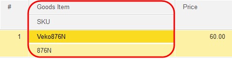
Fig. 47. Groups of list columns
Elements in a form can be visually arranged into groups. A group can be separated with a line or a frame. For example, as shown in the figure below:
Fig. 48. Groups of fields in a form
You can move the form elements between groups. The system defines if such a movement is possible. If the movement requires some properties of an element to be changed, the changes will be applied automatically. For example, if you move a group of elements to a group with the Pages type, the property Type will be changed from Regular group to Page. If this causes changes in requirements to subordinate elements, these elements are either changed automatically or deleted.
The form may contain groups that can be collapsed. These groups are displayed in a special manner: the title contains a link or a button to collapse the group.
Fig. 49. Collapsable Group
When you click the title of such a group, or the button next to it, the contents are hidden.
You can click on the title of the collapsed group again to open the group’s contents.
For details on form customization, see "Form Setup" on the page 142.
2.9.1. Command Bar
A form can contain the groups of controls of the Command bar type. Every command bar consists of a set of buttons (commands) that are effective only for this given form or a specific portion of the form.
Use keyboard shortcut Alt + F10 to activate a command bar. The panel cannot be selected when you switch between form controls using Tab or Shift + Tab. All the buttons are tabbed through and the action is applied by clicking a button of the panel (pressing Enter).
2.9.2. Pages
A form may include pages if it is provided for in the configuration. Page tabs may be displayed vertically (from top to bottom) or horizontally (from left to right) from the page content.
Left-click the required page to select it. You can also switch between pages using Ctrl + Page Up (next) or Ctrl + Page Down.
Every page may include its own form controls. For example, the Invoice document form may include a tab named Goods that will include the list of goods and another tab named Other containing a field for additional description of the shipment (as shown on fig. 50).
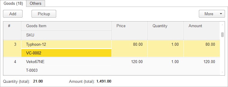
Fig. 50. Pages in the invoice document
2.10. CHART
A chart can be nested in a form or a spreadsheet document.
You can manage a chart nested in a form. Customize it using the attributes available in the form (the assortment is determined during configuration development). You can select another type of chart if source data allows. For details on working with a chart in a spreadsheet document, see "Working with Charts" in the book "1C:Enterprise 8.3. User manual" in the Appendix named "Spreadsheet Document Editor" available in the electronic version of the documentation.
2.11. TEXT DOCUMENT FIELD
A Text document field is used to work with texts. It includes a window of the text editor intended to enter and save lines of text. For details on working with the editor, see book "1C:Enterprise 8.3. User manual", Appendix named Text Document Editor (available in the electronic form of the documentation).
2.12. HTML DOCUMENT FIELD
An HTML document field is intended to view an HTML document in a form. When you view the information available in the field, you can navigate by links (if any). The following commands are available for the field: Print, Print preview, Save As.
2.13. GRAPHICAL SCHEMA FIELD
A Flowchart field form control is intended to view and edit a graphical schema.
Editing of graphical schemas is described in book "1C:Enterprise 8.3. User manual", Appendix 4 Graphical Schema Editor (available in the electronic version of the documentation).
The order for tabbing the schema elements is specified during configuration development.
You can select the scale to view a graphical schema using the Graphical schema – Scale menu item.
You can also change scale using a mouse with scroll wheel by pressing and holding
Ctrl.
This field supports display of common route maps of business processes or route maps of particular instances of business processes, taking passed and active route points into account.
A route map of the sales business process can be quoted as an example of displaying a route map in a graphical schema.
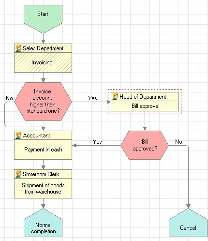
Fig. 51. Graphical schema of a route map
The passed points of a route are displayed with shaded background (Invoicing on the figure). A route point is considered to be passed when all the tasks associated with the point have been performed.
Active points are framed with a red dashed line. A route point is considered to be active when it has one or more incomplete tasks associated (Bill approval on the figure).
2.14. IMAGE FIELD
The Image field element is used to place various images in the form. This element can also contain a link (see the "Hyperlink" description).
In some situations when the picture does not fit in the field, scroll bars are displayed when you select the element. These scroll bars make it possible to view the entire picture (if it is provided for in the configuration). If scroll bars are available, you can also move the picture using the arrow keys, Home (show top left corner), End (show bottom right corner), Page Up (go up by window size vertically or horizontally if Alt is held down), and Page Down (go down by window size vertically or horizontally if Alt is held down).
If your mouse has a scroll wheel, you can scroll the image vertically by rotating the wheel forward (up) and backward (down). If you press Shift while scrolling, the picture will be scrolled horizontally.
The Image field element of a form will have a context menu with the following options: Copy, Save As, View Image.
The Copy menu item copies the picture to the clipboard for subsequent paste into another application.
The Save As menu is available for the pictures loaded from files. Use it to save a picture as a file on the disk.
If you select the View Image command, the window for viewing the picture will be displayed. This window includes buttons to zoom in and out and to select actual size. The window can be resized. Use the Zoom in, Zoom out, and Original Size menu items to select the required scale. You can also use the NumPad keys to change scale as well. Pressing + (plus) zooms in while pressing - (minus) zooms out. The Original Size command selects the actual size of the picture.
Please note that the picture should be "in focus" for all the actions executed with your mouse; this means that you should first click it. If you click one of the buttons, this button will be in focus and further mouse actions (scrolling and scaling) will be disabled until the focus is switched back to the picture itself again.
You can also change scale using a mouse with a scrolling wheel by pressing and holding Ctrl. To zoom in, rotate the wheel forward, and to zoom out, rotate it backward. You can also change scale using + (plus) and - (minus) keys located to the right of the NumPad.
2.15. SPREADSHEET DOCUMENT FIELD
A form can contain a nested spreadsheet document (the Spreadsheet document field element). For details on working with the Spreadsheet document field, see book "1C:Enterprise 8.3. User manual" Appendix 3 supplied in electronic version of the documentation.
Navigating in spreadsheets. A spreadsheet document window always displays only a portion of the spreadsheet located in the window. Use your mouse to select a cell of the spreadsheet. The selected cell is activated. Use scroll bars to display the areas that did not fit in the window.
TIP
To scroll a document horizontally, press and hold Shift and use the mouse scroll wheel.
For convenient scrolling of a large document, you can press the mouse wheel and select the scrolling direction with your cursor. The scrolling speed depends on the distance between the current cursor location and the location where the mouse wheel was pressed (specifically designated).
Managing a spreadsheet view. Use the Table – View submenu items to configure view of various areas and components of a spreadsheet document: column and row headers, grid, etc.
Let us briefly describe the View menu items. Every menu item works as a radio button: when an item is selected (pressed), the corresponding area is displayed or hidden.
|
Menu item |
Action |
|
Dock Table |
Locks the top rows and left columns of a spreadsheet document so that they will always be displayed when the document is paged through. |
|
Show Grid |
Toggles display of the spreadsheet grid (thin lines that separate cells). |
|
View Headers/Footers |
Manages display of the row and column headers in a spreadsheet document. |
|
View Groups |
Shows and hides groups – the areas to the left of the row header or above the column header. |
|
Edit |
Locks or unlocks spreadsheet documents for changes. |
|
Show Comments |
Toggles display of comments. |
|
Black and White View |
Toggles display of colors specified for the spreadsheet document. When this item is selected (checked in the menu), all the colors will be defined by Microsoft Windows operating system settings. |
|
Page view mode |
Toggles display of a minimum number of rows (depends on the entered information), print area, page breaks. |
|
Scale |
Performs a discrete image scale. When this item is selected, a submenu opens that you can use to select the desired scale for the spreadsheet document. |
TIP
Scale can also be changed using a mouse with a scroll wheel. Press and hold Ctrl and rotate the mouse wheel. Turn the wheel forward to zoom in or backward to zoom out.
Docking a table (headers). In the 1C:Enterprise spreadsheet editor, the top rows and left columns of a spreadsheet document may be locked so that they are always displayed when scrolling through the document.
To dock the top rows of a spreadsheet document, highlight the entire row and select the Table – View – Dock Table menu item. All the rows above the highlighted one will be docked.
To lock spreadsheet columns, select the entire spreadsheet column. All the columns to the left of the selected one will be docked.
To lock spreadsheet rows and columns simultaneously, highlight one cell of the spreadsheet. All the rows and columns to the top and left of the highlighted cell respectively will be locked.
To unlock the locked elements, select Dock Table again.
Setting as read-only. To prevent a spreadsheet document from editing, use Table – View – Edit menu item (this item should be unchecked).
If a cell contains the text that does not completely fit in the visible area, on mouseover the text is displayed as a tooltip. If the text is too large to fit in a tooltip, only part of the text will be shown.
2.16. THE FORMATTED DOCUMENT FIELD
A form may have a Field of formatted document element used for storing text documents with the following formatting: color highlighting, text font changes, hyperlinks, pictures, etc.
This field may be used to create an e-mail message or edit a simple html document.
If a formatted document field is in View only mode, the user may navigate the links in the document. Navigation is performed in a new browser window.
The main menu File – Save and Save As commands help save formatted documents as text files or html documents.
Documents can be formatted with the commands in the command bar of the document being formatted.
Below is a short description of formatting options.
Changing Fonts. There are two ways to change the font in a document.
Select the Font menu option and then choose the font, font size and style (Bold, Underline, Italic, Strikethrough) in the Select font dialog, then press OK.
Select the text for which you want to change the font and increase or decrease the font size incrementally using the toolbar commands, and then select the font style (bold, italic or underlined).
Selecting Text and Background Colors. 1C:Enterprise allows you to highlight the text with a background color or text color. To do this, select the text and choose Change background color on the toolbar (to change the background color of the text) or Change text color (to change the color of the text itself). Select the color in the Choose color dialog and press OK.
Inserting a Hyperlink. Formatted document text may contain hyperlinks.
Select an object (text or picture) and choose the Insert hyperlink menu command. The formatting dialog is then displayed on the screen. Specify the hyperlink address in the Link field and press OK.
You can format the selected object in the style normally used for hyperlinks, which is blue underlined text.
Inserting a Picture. You can also include pictures in a formatted document.
To insert an image file, select the Insert picture command and choose the file you want in the standard file selection dialog.
Inserting Symbols. Use the Insert symbol command to add symbols from the list into a text.
Inserting a List. Use the Bullet list option to start a bulleted list, or the Numbered list option to start a numbered one. Then enter the text.
To add the following element to the list, press Enter.
To end the list, press Enter twice or press Backspace to delete the last bullet or number in the list.
Alignment Setup. The text may be aligned to the left or right margins. A justified alignment (i.e., to both the left and right margins) may also be used.
Select the text you want to align and press Left/Right/Center/Justify.
Indented Text. You can increase or decrease indention for one or several text passages from the edge of the field.
Select the text and press Increase Indent to increase indention, or Decrease Indent to decrease it.
Line Spacing. To set the line spacing, select the text and choose Line spacing. In the window that opens enter the desired spacing with the keyboard or with the keys and press OK.
2.17. MANAGING A FORM AND SAVING SETTINGS
When numerous attributes are located in a form, the configuration can specify for saving the sets of the attributes with their values to use them when required.
The commands Save settings and Restore settings are used for this.
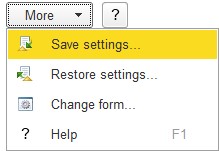
Fig. 52. Commands to manage form parameters
Enter the required values for the form fields and select Save settings. In the Save <object name> settings window that opens enter a name for the set of the parameters to be saved and click Save.
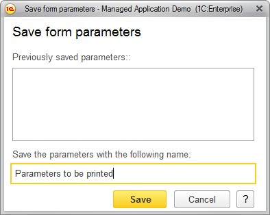
Fig. 53. Saving form parameters
To use the form parameters that were earlier saved, select Restore settings item. In the window that opens select a set of parameters and click Select.
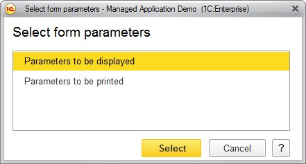
Fig. 54. Selecting the saved form parameters
The parameters of the selected set will be used as the parameters for this form.